Voting period is over. Please don't add any new votes.Voting period ends on 11 Aug 2010 at 07:47:42 (UTC)
Visit the nomination page to add or modify image notes.
Featured picture candidates/File:Nikola Zrinski Sigetski - spomenik u Čakovcu.JPGCommons:Featured picture candidates/File:Nikola Zrinski Sigetski - spomenik u Čakovcu.JPG
Oppose The image is more about the supposed humour of the mising 'C' rather than the subject of Canal Street. If the 'C' had been there then it might be okay for showing the degradation of this part of Manchester. fr33kman-s-20:13, 19 March 2009 (UTC)[reply]
Thank you for nominating this image. Unfortunately, it does not fall within the Guidelines and is unlikely to succeed for the following reason: the file is much too small.
Anyone other than the nominator who disagrees may override this template by changing {{FPX}} to {{FPX contested}} and adding a vote in support. Voting will then continue in the usual way. If not contested within 24 hours, this nomination may be closed.
Thank you for nominating this image. Unfortunately, it does not fall within the Guidelines and is unlikely to succeed for the following reason: it is too small
Anyone other than the nominator who disagrees may override this template by changing {{FPX}} to {{FPX contested}} and adding a vote in support. Voting will then continue in the usual way. If not contested within 24 hours, this nomination may be closed.
Thank you for nominating this image. Unfortunately, it does not fall within the Guidelines and is unlikely to succeed for the following reason: the image does not meet size requirements.MER-C01:44, 20 March 2009 (UTC)[reply]
Anyone other than the nominator who disagrees may override this template by changing {{FPX}} to {{FPX contested}} and adding a vote in support. Voting will then continue in the usual way. If not contested within 24 hours, this nomination may be closed.
Comment from uploader - it is simply too small at 964 x 640. However, no higher resolution is available because the creator is "thinking of pitching to the museum store for prints and postcards." I agree, it's a great photo, and I hoped that he would release a high-res one...but he can't, and this one does not meet the standards. Cheers, —Ed 17(Talk)02:12, 20 March 2009 (UTC)[reply]
Oppose -- The motive blends in too good with the surroundings to make this a good picture. The composition of the photo is sub optimal due to being shot straight from the nose with the rest of the moray blurry. -- Peipei (talk) 18:29, 19 March 2009 (UTC)[reply]
Thank you so much, Notyourbroom, for kindly explaining to me what CA means. I guess I'll let go on it. I do no know how to correct it in such an inconvenient place as a dorsal fringe. If the image gets promoted fine, if it does not fine too. The image has already done its job. It was used to create stuff eel to educate kids in Hawaii. Here's the image of my eel and the kids in Waikiki Aquarium. These are the reviewers I'm always happy to take pictures for. :), and all of you too of course. Thank you.--Mbz1 (talk) 21:30, 20 March 2009 (UTC)[reply]
Oppose sorry. For 2 reasons i can't support this actually nice pic. First there seems to be a lot of noise, especially on the rocks. The second thing is that I don't like the composition. If you crop the left part away to get the hut in the lower left corner you have a much better composition (imho). A big panorama is not everything... --AngMoKio (talk) 23:25, 20 March 2009 (UTC)[reply]
Question Can you add the species name to the description page? As a reminder, the FPC guidelines state that "Quality images must be categorized, have meaningful title and description. This should include the scientific names for minerals and taxa naming for organisms." --Notyourbroom (talk) 23:44, 20 March 2009 (UTC)[reply]
Thank you for nominating this image. Unfortunately, it does not fall within the Guidelines and is unlikely to succeed for the following reason: because the image quality is poor (no detail, unfocused subject) and the species is not identified -- Alvesgaspar (talk) 01:58, 21 March 2009 (UTC)[reply]
Anyone other than the nominator who disagrees may override this template by changing {{FPX}} to {{FPX contested}} and adding a vote in support. Voting will then continue in the usual way. If not contested within 24 hours, this nomination may be closed.
Neutral but leaning towards opposition. There's some pretty severe CA and the picture is blurred as though the camera had been shaking. That's all a pity to me, because it's otherwise an incredible shot. --Notyourbroom (talk) 18:44, 22 March 2009 (UTC)[reply]
I may nominate this one, but not until after the community has spoken on this image. I'll remind all to not let the double/triple reflection on the astronaut's headgear throw you off. Thanks for those suggestions! Natural RX (talk) 22:46, 22 March 2009 (UTC)[reply]
My pleasure. It's annoying, I know, when you think you've found a great image, and the community doesn't agree (see the link on my userpage for evidence!). But stay a while, and you'll learn fairly quickly, though it might not be all fun and games. *Winks at Lycaon*
Thank you for nominating this image. Unfortunately, it does not fall within the Guidelines and is unlikely to succeed for the following reason: the image is less than one half of a megapixel-- less than 25% of the normal cutoff. Are we certain no higher-resolution version exists? I would think it would be a shoo-in at an adequate level of resolution, so in that regard, this is a great find. --Notyourbroom (talk) 16:48, 22 March 2009 (UTC)[reply]
Anyone other than the nominator who disagrees may override this template by changing {{FPX}} to {{FPX contested}} and adding a vote in support. Voting will then continue in the usual way. If not contested within 24 hours, this nomination may be closed.
Comment Thank you for that information, Diti-- your assumption that I did not know about the size restriction was correct. I leave anyone to challenge my FPX if they desire to, but I do feel it would be inconsistent with the concept of a FP to promote an extremely low-resolution image simply because a higher-resolution version would be unfree. An argument could be made that it would be a sort of provisional promotion in lieu of the higher-resolution version (which- one assumes- would be made available after a certain number of years) but at the very least, that would necessitate a template along the lines of "This FP must be replaced with a higher-resolution version when such a substitution becomes legal." All in all, I'm uncomfortable with the idea, and I do not withdraw my FPX. I appreciate your information on the matter, though. --Notyourbroom (talk) 17:20, 22 March 2009 (UTC)[reply]
To expand upon my above comment slightly, I do think it would be good to have a category or template marking images such as this one as promising FPCs which simply do not have free high-resolution versions at this point in time. I don't think there ought to be any kind of formal voting process for this designation, but it could be a good idea for the future to mark relevant images for future consideration once a larger version of the image becomes available. I am a new member and do not know the best way to formalize this suggestion, but I encourage anyone interested in this idea to articulate and expand upon it in the appropriate forum. --Notyourbroom (talk) 17:34, 22 March 2009 (UTC)[reply]
I have considered creating a page where people could list those types of images; however the number of great images that are hamped by small size is tremendous. Maybe something like Commons:Larger Needed? People could search for larger versions of those existing images. Sarcastic ShockwaveLover (talk) 18:26, 22 March 2009 (UTC)[reply]
Thank you for nominating this image. Unfortunately, it does not fall within the Guidelines and is unlikely to succeed for the following reason: the quality of the image is poor: general unsharpness and noise -- Alvesgaspar (talk) 01:13, 28 March 2009 (UTC)[reply]
Anyone other than the nominator who disagrees may override this template by changing {{FPX}} to {{FPX contested}} and adding a vote in support. Voting will then continue in the usual way. If not contested within 24 hours, this nomination may be closed.
Oppose Sorry. Composition is a bit cluttered, the flower doesn't really stand out in front of the grass. You also have to take care that the sharpness is on the main object. Don't give up and try again ...welcome to FPC :-) --AngMoKio (talk) 16:04, 24 March 2009 (UTC)[reply]
Thank you for nominating this image. Unfortunately, it does not fall within the Guidelines and is unlikely to succeed for the following reason: because the image is underexposed, has a poor jpeg quality and is tilted -- Alvesgaspar (talk) 10:07, 24 March 2009 (UTC)[reply]
Anyone other than the nominator who disagrees may override this template by changing {{FPX}} to {{FPX contested}} and adding a vote in support. Voting will then continue in the usual way. If not contested within 24 hours, this nomination may be closed.
Not exactly heaven; I live in the city ;) I haven't seen the fly again. As Richard said, it looked a bit misplaced but when I tried to straighten it out, it zoomed away --Muhammad08:49, 24 March 2009 (UTC)[reply]
Info created, uploaded, and nominated by Dimitri Torterat. The photo takes place underneath the Eiffel Tower, during a rainy, windy, but sunny day. The place is very often filled with plenty of people, so I had to chose a wide aperture for isolating the subjects of the photo. Digital editing was possible to give this photo a lower exposure, and a « better look », but it resulted in quality loss. I decided not to include a person on the left side while taking the photo, maybe that was a mistake. →Ditithepenguin — 21:29, 29 March 2009 (UTC)[reply]
Oppose I am aware of the discussion regarding the last image of this type that was nominated, but this just seems like a tourist snapshot, albeit a much higher quality one. It's annoying you can't get the Eiffel Tower in shot. :( Sarcastic ShockwaveLover (talk) 00:06, 30 March 2009 (UTC)[reply]
Oppose - Everything, except the radiant smile of the child. Like Sarcastic ShockwaveLover, I can't see anything more than a snapshot. You can shoot Tour Eifel, "mais seulement quand elle n'est pas illuminée" (only when it is not lighted) - that is the weird French law -- Alvesgaspar (talk) 00:49, 30 March 2009 (UTC)[reply]
{{FPX|the tortoise is not sufficiently identified.}} If you find out the species, please also recategorize accordingly. Lycaon (talk) 22:34, 22 March 2009 (UTC) fixed. Thanks. Lycaon (talk) 09:11, 23 March 2009 (UTC)[reply]
Oppose Too small subject (and too little detail) for the smallish file size. Doesn't reach the current standards for macro photography. It is a very interesting capture though which would make a handsome VI. Lycaon (talk) 13:56, 22 March 2009 (UTC)[reply]
Support from me, though speaking from an unscientific perspective, I would have liked a slightly different angle focusing more on the anterior than the posterior. --Notyourbroom (talk) 16:50, 22 March 2009 (UTC)[reply]
Oppose There could be more and finer details and a tad more DOF for that small image size with the amount of unused background ... flashlight is 2 harsh for my taste, otherwise nice colors and good composition --Richard Bartz (talk) 21:27, 22 March 2009 (UTC)[reply]
was just kidding...Digital cameras store EXIF-Data with the pic in which you can see technical details about how the pic was made (aperture, shutter speed and so on..). Btw do u agree with my statement about the lost nuances? --AngMoKio (talk) 16:59, 22 March 2009 (UTC)[reply]
hm..I have a calibrated monitor. But even when I increase gamma or brightness in the new version i can't see the details of the old one. Look at the jacket details of the guy on the plain. There are several details lost that you clearly see on the original (at least with my monitor). --AngMoKio (talk) 21:43, 23 March 2009 (UTC)[reply]
Oppose after a second look i found out that the restored version lost quite some details and nuances. It is very obvious when you compare the guy on the plane in the original and the new version. I guess this shouldn't happen when you restore photos. --AngMoKio (talk) 14:40, 22 March 2009 (UTC)[reply]
Oppose – Until the present ambiguity between the intrinsic value of a picture and the quality of a restore is resolved by a vast community consensus and proper assessment criteria. That ambiguity has lead to the unilateral creation of this page (which is a showcase of Commons to the outside world) and the self-promotion of its two members. In the process, the concept of "Feature picture" and this very forum were abused in a way I consider to be unacceptable. If someone considers this vote to be just a POV, please strike the vote but leave the protest. -- Alvesgaspar (talk) 12:23, 22 March 2009 (UTC) No longer applies -- Alvesgaspar (talk) 18:22, 22 March 2009 (UTC)[reply]
Oppose - agree with AngMoKio. It's most noticeable on the man on the right, but you can also see it on the engine. Something's wrong with the levels/contrast. Otherwise a fine job. Lupo16:20, 25 March 2009 (UTC)[reply]
Oppose I'm opposing this on grounds unrelated to the subject matter, though I'm sure there will be at least one or two who oppose it for being "military-glorifying propaganda" or some such related notion. My view from a quality perspective is that the whole image has a muddy, noisy feel to it, and I don't much like the composition, either. --Notyourbroom (talk) 20:54, 21 March 2009 (UTC)[reply]
Oppose lack of composition and war pics can't give me wow. I am not in general against war photos, if they document a war in a realistic way, cruel and senseless as they are, then I can support them. --AngMoKio (talk) 22:58, 21 March 2009 (UTC)[reply]
Support A rare high quality image from Afganistan. Of course the wars are cruel and horrible. Too bad that sometimes there's no other choice, but to fight the war.--Mbz1 (talk) 04:56, 22 March 2009 (UTC)[reply]
Oppose, too much contrast between the dark house in the front and the excessively bright sky - i.e. poor light conditions. --Aqwis (talk) 17:13, 26 March 2009 (UTC)[reply]
Comment - Welcome to FPC, llorenzi! Please don't consider the criticism as unecessarily harsh. But these are supposed to be the best of the best images in Commons. Go on trying, but pay attention to details and try to get the best possible from your camera (better yet if you get a better one...) -- Alvesgaspar (talk) 02:15, 21 March 2009 (UTC)[reply]
Oppose Looks as if NASA has problems with focussing and cropping ;-). I'm used to better quality from their hardware. Lycaon (talk) 14:09, 20 March 2009 (UTC)[reply]
I`m fairly new to examining photos, so could you explain where the focusing is wrong? The cropping I can understand, though I personally don`t think it detracts very much. On a side note, if you have time, it would be helpful if you could examine some of the other images I plan to nominate, see the link on my user page. Sarcastic ShockwaveLover (talk) 16:02, 20 March 2009 (UTC)[reply]
Comment - I'd say that that picture is more diffuse in what's wrong with it, I for one would have opposed it. But stitching errors are such a clear way of noticing that the picture is sub-par and should not be classed as a featured picture. -- Peipei (talk) 21:53, 20 March 2009 (UTC)[reply]
Info I have dropped a request that the stiching errors get fixed. You may don't move that page to the old discussions now if you close it. --D-Kuru (talk) 00:54, 28 March 2009 (UTC)[reply]
Oppose The storyline is not well. The picture should be flipped, in the way that Dart's line goes before Luke's. --Lošmi (talk) 01:20, 1 April 2009 (UTC)[reply]
Support Very nice resolution, natural appearance. EV seems quite high. Did you use Google translator set on translate from insect to english? --Muhammad (talk) 04:42, 1 April 2009 (UTC)[reply]
request: Can you please also make a pic for the scene with Jabba the Hutt and Princess Leia on the planet Tatooine? Would love to see that ;) --AngMoKio (talk) 09:46, 1 April 2009 (UTC)[reply]
Strong info Princess Leia is mating right now, but how about that ? --Richard Bartz (talk)
lol...we should start a new category the Lolbugs. But now fun aside: The picture for sure has encyclopaedic value but unfortunately it is tilted and furthermore geotag has to be wrong. I saw Luke lately here. I seriously doubt that he was in Bavaria. That's why i can only give a weakNeutral --AngMoKio (talk) 19:14, 1 April 2009 (UTC)[reply]
Question Could you please give us more informations from where the picture was taken e.g. geocoordinates & geological particularities because the image name (image should be renamed) and the image description isn't really telling, thanks. --Richard Bartz (talk) 13:50, 26 March 2009 (UTC)[reply]
Oppose well taken picture, but there are much better exemples of this IMHO (perhaps if the description explained why this particular one is unique ...) --ianaré (talk) 15:51, 26 March 2009 (UTC)[reply]
Thank you for your comment, Adam. May I please ask you, if you ment that you yourself would like to download the video?--Mbz1 (talk) 15:26, 26 March 2009 (UTC)[reply]
On hold Fantastic and useful file (penguins are rare here), and it's nice to see you improved the quality, but why did the video resolution decreased? VGA format was cool, and for now I don't think I'd feature a video with such a small size. →Ditithepenguin — 18:47, 26 March 2009 (UTC)[reply]
Ah Ditithepenguin , to tell you the truth I doubt this video could be featured. I did it mostly for you because I know you like penguins. With videos higher rsolution does not always mean a higher quality, it might be just the opposite. The only video format Commons accept is OGG. Here's the highest resolution I was able to get after I converted my video to OOG: File:Pygoscelis antarctica trying to get to iceberg edit1.OGG. I cannot play it at my computer at all, so I cannot say anything about the quality. It is for you to decide which one is better. I only like to add that we had a big fun watching those penguins. I do not think penguins had fun too. There was a w:Leopard Seal nearby, and somebody even saw a w:killer whale.Thank you for watching, and please feel absolutely free to oppose, everybody.--Mbz1 (talk) 19:46, 26 March 2009 (UTC)[reply]
Info I've been on a category-restructuring frenzy lately, and I just shuffled around a lot of penguin-related categories and images. :) I also made a category for penguin-related videos. This is a good starting point to explore the new category tree, and of course feel free to make any alterations you want. --Notyourbroom (talk) 01:37, 27 March 2009 (UTC)[reply]
Thank you! May I please ask you, if you were able to watch the higher resolution of the video, and which resolution you liked better? This question is for everybody, please. Thank you for your time.--Mbz1 (talk) 02:38, 27 March 2009 (UTC)[reply]
I did indeed watch the high-resolution version-- it's a very fascinating scene. Almost like watching salmon try to jump up small waterfalls to go upstream. I'd call it very valuable, but alas, the lack of a tripod to keep the camera steady- as well as just the distance between the camera and the subjects- gives it some technical problems. Still a joy to watch, though, and I envy these experiences you have :) --Notyourbroom (talk) 04:52, 27 March 2009 (UTC)[reply]
(undent) I'm not sure I understand your question, Mbz1 :) both versions play fine to me, and it seems to be that as in photography, the highest-resolution version ought to be the preferred archival version. Please clarify your question if I have missed your point. :) --Notyourbroom (talk) 18:35, 27 March 2009 (UTC)[reply]
Well, I guess I was trying to understand what version you as a viewer would prefer, but you already answered my question. Thank you.--Mbz1 (talk) 19:01, 27 March 2009 (UTC)[reply]
There is also the issue that my monitor is set to 1920*1080 resolution, so anything of relatively low resolution seems even smaller to me :) --Notyourbroom (talk) 21:18, 27 March 2009 (UTC)[reply]
Oppose - Composition so-so, poor quality due probably to fanatic de-noising. Detail is also affected by (too much?) light in the main subject. -- Alvesgaspar (talk) 18:43, 27 March 2009 (UTC)[reply]
Thank you for your comment and for your vote. I tried to do de-noising only on the sky and on the water. I guess my efforts failed. BTW this image was taken in the good old time, when I knew nothing about Commons, and what is even more important Commons knew nothing about me :) Back then I just took the pictures, shared them with friends and removed them from my computer most of the times. This one somehow survived. Now I think it might have been better off, if it did not :)--Mbz1 (talk) 19:31, 27 March 2009 (UTC)[reply]
InfoThis "composition" should convince, I mean it'd better does that nobody in the world would go through slave auction ever again. Thank you.--Mbz1 (talk) 22:15, 27 March 2009 (UTC) Sorry. AngMoKio just found an image that has a much better composition that the nominated one, so I retract my words and I am sorry.--Mbz1 (talk) 23:36, 27 March 2009 (UTC)[reply]
Well, the picture was taken with such a perspective that shows how "people", who came there to buy humans were looking at the slaves staying in this horrible hole. Thank you.--Mbz1 (talk) 22:49, 27 March 2009 (UTC)[reply]
Oppose - Agree with AngMokio. The framing and angle don't emphasize the symbolism of the sculpture. Looks like a snapshot to me. -- Alvesgaspar (talk) 01:10, 28 March 2009 (UTC)[reply]
Now it is strange that you opposed my own image per me. I supported my image and I'm still supporting it. No matter the other image has a better composition, the nominated image has much, much bigger EV, but thank you for your vote anyway.--Mbz1 (talk) 20:21, 4 April 2009 (UTC)[reply]
There's absolutely nothing to be sorry about. My bad. I should have said AngMoKio just found an image that has a much better composition that the nominated one, but mine image has a much bigger EV." Best regards.--Mbz1 (talk) 01:37, 5 April 2009 (UTC)[reply]
Reply - Original had the tonal details washed up a little (due to old age probably). At first I left it the same and his skin tone looked very similar to Menahem Begin's, but then we had a bunch of TV shows with clips from those days (we're celebrating 30 years of the peace accords) and he's not just a bit dark like Begin but more Black like Michael Jordan. I used tonal details from the original to dilute the over-exposure a bit and get a more natural (and closer to real-life) tonal output. Hope this answers your query. Jaakobou (talk) 16:42, 30 March 2009 (UTC)[reply]
Thanks for your reply. I am just wondering if a restoration should keep the colours (or in this case the grey nuances) as in the original or if the picture should get adapted to reality. I tend to say that historical documents should get restored in a way that tries to make them look as they were before time, light, dust,.. changed them. A restoration should remove the influence of time on a photo. As you only change this one persons face, I think it was rather a adaptation to reality (imho). But this is really a difficult topic and I am really no expert concerning restoration. --AngMoKio (talk) 17:01, 30 March 2009 (UTC)[reply]
Histogram adjustment affects the whole picture, I guess. Here it is just the face of one person that is affected. When you only change one face you change some "facts" compared to the original. In the original the face was quite bright maybe bcs of a spotlight or sth. In the restored version this is not that visible anymore. I just wonder if this is sth that should be done in a restoration. I am not really sure about it...guess we should discuss it with others too to get to a point. To judge a restoration is a bit different than judging a photos made by commons users. Maybe we even have to add sth in the text about how to judge pictures. It can't be only about wow, composition and technical quality. You always have to compare it with the original to judge the work. --AngMoKio (talk) 20:34, 1 April 2009 (UTC)[reply]
Info This is the religious symbol of Ayyavazhi, a South Indian Dharmic belief system. This Image, I feel, the best, and of highest-resolution among all the similar Ayyavazhi symbol images uploaded here in Wikimedia. It looks good too. So i feel better to nominate it to FPC. This is already a featured Picture in English Wikipedia.
Comment Sorry, Though I agree with the point of User:Alvesgaspar, I like to inform that the reason I nominated the image here was verymuch more than it being merely a religious symbol. This image, I feel is also much more than a mere outlined symbol like this or a less complex (in design) National flag. This is more a 'religious art' than a symbol or an emblem. For instance, the small greenish spikes, the green circular border and the brown background is not part of the "emblem". But it was justified here since it was more a 'religious art'. Of course it (or) part of it may be a religious symbol. But, I like this image to be featured here is not for the reason that it is a 'religious symbol' and for the reason that I believe it's beautiful and very much deserves to be featured as a 'Religious Art' as so in English wikipedia, Thanks. - Vaikunda Raja (talk) 15:18, 30 March 2009 (UTC)[reply]
Comment That is no valid reason to oppose Alvesgaspar. Under your criteria so much could be censored. Art is a reflexion of a culture, religion included, and as such, a theme where creative activity takes place. Religion and art have had a long walk throughout history and I doubt that it will stop anytime soon. --Tomascastelazo (talk) 15:23, 30 March 2009 (UTC)[reply]
IMHO Even with that point, why a religious symbol can't be featured? Then why articles and portals of religions and beliefs are featured in wikipedia? It is not the reason that wikipedia is promoting particular religion, but that accrediting the way it was presented (as per respective MOS). That is the very same case here I am thinking about. - Vaikunda Raja (talk) 15:42, 30 March 2009 (UTC)[reply]
That is just my opinion, not an attempt to introduce censorship. There is so much beyond the strict graphical components of such symbols that I'm afraid we cannot isolate them from the whole. Of course, we can say if we like them or not, in a strict aesthetical sense. But will that procedure be acceptable, when compared with what we do when assessing bug and building pictures? In this particular case, I find the image quite kitschy but that is probably because I'm not aware of its detailed symbolism. Should I be? Both a simple cross and Bach's Mass in B minor have strong religious content. But while I can still enjoy and understand Bach's masterpice being unaware of that component, that is obvioulsy not true with the cross. The same goes with national symbols and, for example, Tchaikowsky's 1812 piece. -- Alvesgaspar (talk) 16:23, 30 March 2009 (UTC)[reply]
Let me ask an academic question, which will make my point clearer: would Vaikunda Raja consider nominating this picture as a purely abstract creation of his own, saying nothing about its religious content? And would the chances of promotion improve by doing so? -- Alvesgaspar (talk) 17:15, 30 March 2009 (UTC)[reply]
If I understood you correctly, any-work which could create a symbolic ideology such as religious sentiment or Nationalism should not be given any featured or special status? Am I correct? If so, further sharpening your views, if I understood rightly, not even an outstanding photograph (or) a well written article that of a religious (or national) building or symbols shall be featured.
But it is not the case here in wikimedias. Here every thing including the ones which you neglected enjoys the featured or similar status; It be article, Category, List, Portal, Images or videos. The only thing is it should meet the appropriate criteria. - Vaikunda Raja (talk) 17:54, 30 March 2009 (UTC)[reply]
No, you didn't understand correctly. My examples clear show that I'm not against featuring works with religious content. I'm only against promoting religious, national and partidary symbols or emblems. And I don't make any distinctions between the national flag of Portugal, the swastika or the Christian cross. As for the rules and criteria governing these issues they are not shared by the different wikis. There is an enormous difference between featuring an article on the Nazi ideology and featuring the swastica! Because the first can be neutral but not the second -- Alvesgaspar (talk) 18:33, 30 March 2009 (UTC)[reply]
All religious images imply a transmission of ideology, the recipient, however, may or may not accept the symbolisms that such images convey. There are many variables involved. Protestants, for example, may take offense at catholic imagery, or jewish people at nazi symbols. However offensive the symbols may be to certain people, they exist outside an ideological realm and can be appreciated from different contexts, cultural, historical, etc. To suppress nazi symbols does not make the past dissapear, and in fact, may even contribute to forgetting the terrible events, which in turn, as we say in Mexico, the medicine would be worse than the illness. So in this small FPC world IMO it would be better to limit support or oppose votes strickly on technical and other relevant criteria aligned with the advancement of knowledge and preservation of history in general and not rely too much on the small world of personal opinions. --Tomascastelazo (talk) 19:26, 30 March 2009 (UTC)[reply]
The point is not whether they have an ideological value for FPC, that doesn't matter. The point is that once FP, they will become POTD, nolens volens one day and at that time make publicity for that particular ideology and that would be wrong. Lycaon (talk) 21:49, 30 March 2009 (UTC)[reply]
I think that introducing the ideological variable to FPC is foolish. It is hard enough to agree on aesthetic, cultural, historical, encyclopedic value as it is, and to throw in the possible implications of ideology of images on some people is a recipe for disaster. A cross, or an image of a cross could be an insult to muslims, a swastica to jews, nudity to puritans, and so on and so on... yet, neither crosses, swasticas nor nudity cease to exist or dissapear from history. Unless of course we turn over FPC to the Talibans and have them determine acceptable content from now on and have them delete what they don´t like. Much of graphic creation, sculptures, architecture, photography, drawings have an ideological base, consciously or unconsciously, and even if they come from the most abhorrent political spectrum, the work itself, the thing, does not necessarily lose its qualities as a work of art, or neither because it comes from there can it constitute itself in a piece of art. By exersicing good judgement by the community offensive material can be filtered out, ans solely based on technical and cultural quality. Unless of course we stick with the birds and the bees... --Tomascastelazo (talk) 22:54, 30 March 2009 (UTC)[reply]
@ Lycaon - But the same is true of every image we promote. Shots of Catholic stained glass windows get promoted, thus making 'publicity for that particular ideology'. The same could be applied to shots of dead chickens, PETA may come after us saying that we approve of animal slaughter. But it was still promoted. There are American military aircraft Featured, when those reach POTD, will we be accused of favouring the US? Whether or not we realise it, each image that is promoted could be 'publicity for that particular ideology'. Singling one out is just hypocritical. Everyone seems to forget that this is Commons. If one side thinks that there are too FPs of one particular thing/idea/faith/country, they can always upload some of their own, and nominate them. It's a about quality and message, and I don't have to be religious to appreciate a religious photo. Sarcastic ShockwaveLover (talk) 03:46, 31 March 2009 (UTC)[reply]
Oppose You've got to ask yourself - would this picture even be nominated if it was not a religious symbol? If the answer is "no", then oppose. If you think it would be worth featuring without it's religious connotations, then support. This has nothing to do with censorship as far as I am concerned, it simply "has no wow". Plrk (talk) 00:02, 31 March 2009 (UTC)[reply]
Originally I created this image using Adobe Illustrator. But due to 'forced rasterisation' of certain parts (the flower petals) while converting to SVG, the whole image was converted to a PNG and was uploaded. I also made a trial in Wikipedia:Graphic Lab but failed. - Vaikunda Raja (talk) 06:08, 31 March 2009 (UTC)[reply]
Voting period is over. Please don't add any new votes.Voting period ends on 23 Jul 2019 at 17:54:22 (UTC)
Visit the nomination page to add or modify image notes.
Featured picture candidates/File:Albert Einstein Head cleaned.jpgCommons:Featured picture candidates/File:Albert Einstein Head cleaned.jpg
Abstain Albert Einstein in 1947; Similar image nominated in April of 2009 and failed; I have no clue at how likely it is that this image will succeed. However a similar image is featured on both the Arabic and Persian wiki's and is a valued image on Commons. -- Fluffy89502 ~ talk17:54, 14 July 2019 (UTC)[reply]
*Support Looks very slightly tilted CCW, but it's probably just the way the uneven shoreline messes with my perception of the horizon. --Notyourbroom (talk) 20:57, 20 March 2009 (UTC)Removed support because the "Edit 1" version has sufficient support to become a FP.[reply]
Comment - Maybe so, but the picture would benefict from a slight CW tilt, even if formally incorrect. I found the composition a bit boring, with the horizon dead centered in the frame. A little crop on top? I'm not sure it works. -- Alvesgaspar (talk) 02:20, 21 March 2009 (UTC)[reply]
Oppose sorry - poor optic quality, big CA. Also don't composition - seems too flat and too tightly cropped at top (original is much better). But I think it is really great place :) --Dmitry A. Mottl (talk) 22:53, 23 March 2009 (UTC)[reply]
The original nomination is clossed already. I'm not sure I have the right to overwrite the image with a new version at this point, or do I? Thank you.--Mbz1 (talk) 01:16, 30 March 2009 (UTC)[reply]
Oppose photographing snow is not the easiest thing, especially to get it white, as it should be. On this pic most snow is kind of bluish (bcs of underexposure I guess). Furthermore the composition also doesn't really convince me. It is a very big panorama for sure and it might be difficult to get all those pictures together ...but also in panoramas there has to be a convincing composition imho. --AngMoKio (talk) 14:02, 21 March 2009 (UTC)[reply]
CommentI wouldn't agree with AngMokio abt the composition, but the snow should be white. Might be a white balance problem? --Muhammad16:50, 21 March 2009 (UTC)[reply]
The snow is white in the sunlight. If I would change the white balance to turn the bluish snow in the shodows to white, the snow in the sunlight would red/yellow. MatthiasKabel (talk) 17:41, 21 March 2009 (UTC)[reply]
For some reason I cannot see the image in the full resolution. Does somebody else has same problem? Thank you.--Mbz1 (talk) 04:59, 22 March 2009 (UTC)[reply]
Yes, I do. It´s probably to big (39 MB). If you use Firefox and it crashes: I already files a bug for this and it will be fixed in Firefox 3.1beta3 and later versions. --norro21:25, 23 March 2009 (UTC)[reply]
Info Extremely rare example of Japanese art depicting Commodore Perry's visit which led to the opening up of Japan. Restored from the Library of Congress copy, which is, at most, one of only a handful of copies. As time has not been kind to it, I have not attempted a complete restoration, as the unrestorable parts would look awkward next to the restored ones. I did, however, do substantial work in the name of readability and to remove highly distracting damage, such as a large stain. Adam Cuerden (talk) 03:25, 22 March 2009 (UTC)[reply]
Oppose – Until the present ambiguity between the intrinsic value of a picture and the quality of a restore is resolved by a vast community consensus and proper assessment criteria. That ambiguity has lead to the unilateral creation of this page (which is a showcase of Commons to the outside world) and the self-promotion of its two members. In the process, the concept of "Feature picture" and this very forum were abused in a way I consider to be unacceptable. If someone considers this vote to be just a POV, please strike the vote but leave the protest. -- Alvesgaspar (talk) 12:22, 22 March 2009 (UTC) No longer applies -- Alvesgaspar (talk) 18:21, 22 March 2009 (UTC)[reply]
Comment Wikipedia has this "rule" that you should not Wikipedia is not there to make a point. I find that Alvegaspar is not assessing the picture but making a point. Arguments about restorations as I understand it are about what makes a great restoration. They are hardly about what makes a featurable picture. Thanks, GerardM (talk) 13:04, 22 March 2009 (UTC)[reply]
Support -- GerardM (talk) 13:04, 22 March 2009 (UTC) This is a fine pictue it has relevance for the WMF projects and it is therefore featurable.. It is a fine restoration as well.[reply]
Oppose – WikiCommons is not there to make a point. And that is exactly what this page is set out to do. So I will join Alvesgaspar in his protest vote. And on another note, why do you have to fill your upload history with 16 versions of 15Mb each (sic) within a few days before you are satisfied? This can better be done off line. If you must preserve the history of your different attempts, then why not upload those at lower jpg resolutions? Lycaon (talk) 14:07, 22 March 2009 (UTC) Looks as if the main reason for this dissident vote has been removed for now, so is this opposition. Lycaon (talk) 18:04, 22 March 2009 (UTC)[reply]
Lycaon, I have not participated in any discussion related to that page in a week, because I only started it as a favour to a friend. There is a thread on Commons talk:Featured picture candidates that you are, of course, able to participate in. This is not the place for such discussion, and as you say, WikiCommons is not here to make a point, which is what this hijacking of a Featured picture candidacy to harass someone can only be described as. Adam Cuerden (talk) 14:52, 22 March 2009 (UTC)[reply]
You are conflating issues. Your very argument is what may make the featured picture candidates a battle ground. This is to argue the merits of THIS picture. You are using your vote as an instrument to protest, to make a point. Please desist from such nonsense because this damages Commons. Thanks, GerardM (talk) 15:25, 22 March 2009 (UTC)[reply]
What has this to do with being an admin? A bit confused? Admins are regular users that have taken upon them to perform extra maintenance tasks for which extra access is required. Am I not doing my job? Are admins supposed to be opinionless? Lycaon (talk) 16:56, 22 March 2009 (UTC)[reply]
This is not a comment appropriate to the context of FPCs, but I have to second what GerardM has said, and what several others have said before him in other threads. I have only been an active Commons member for about a month, but Lycaon's behavior has often confused and bothered me as well. In this thread in particular, his sniping about "...fill[ing] your upload history with 16 versions of 15Mb each" boggles the mind. As I understand it, one of the pillars of Wiki-style collaboration is having a rich version-history archive to work from. In providing a gradual buildup to his final restoration, Adam Cuerden enables future restorers to branch off from his work at a point of their choosing, rather than having to pick between fully-unrestored and fully-restored versions. I think it's commendable, forward-thinking behavior, and is not something to be belittled. How an administrator could become mixed up on this point is beyond my comprehension, and so his words just come off as a weak attempt at a personal attack. I have no prior investment in any of these controversies, so I hope this viewpoint is accepted as a third-party assessment of the situation. --Notyourbroom (talk) 17:05, 22 March 2009 (UTC)[reply]
Comment Not bashing, merely examining your conduct and attitude, in light of your admin status. I agree wholeheartedly with Notyourbroom; we are here to judge pictures on their own merit, and not let anything else influence that. Whether or not you agree with the establishment of Meet our Restorationists (who do a fine job, by the way), that has no bearing on this picture. Evaluate the picture, nothing else. Sarcastic ShockwaveLover (talk) 18:39, 22 March 2009 (UTC)[reply]
Please, please read the discussion page before commenting on this! It is precisely the object of evaluation in FPC that was implicitly subverted by the way the page was created! Sorry to be so bold but I'm already tired of repeating the same thing over and over again: one thing is to assess the value of a picture, a completly different thing is to assess the quality of a restoring. And these two things cannot be mixed up in FPC! -- Alvesgaspar (talk) 20:04, 22 March 2009 (UTC)[reply]
Will you PLEASE stop disrupting FPC, and go to the talk page? Furthermore, as this message by Alvesgaspar continues his harassment and disruption campaign even after I disowned meet our restorationists and removed my name from that page, it is clear that appeasing Alvesgaspar is not going to work. I hence have resored my name to Commons:Meet our restorationists, and will fight for the right of restorationists to be recognised with every tooth and nail. Adam Cuerden (talk) 07:28, 23 March 2009 (UTC)[reply]
Alvesgaspar you conflate two issues and you are wrong in doing so. You can assess pictures that are to be featured, that is what this is about. If your point is that you cannot assess restorations, then do not do that. It is not possible to technically assess restorations anyway because Commons does not have the technology to make that possible. We are slowly moving in that direction because we can now upload the work files as a tiff. These file cannot be shown in a thumbnail or otherwise yet. This information is not new to you. Now desist of further nonsense, you agree that these pictures are important, the only argument you are left with is being uncomfortable that restorations are in a category of their own and that there has been no lengthy discussion about it. As you already implicitly agreed that restorations are in a category of their own, there is not much to discuss. My problem is that you make it seem as an "us and them" conflict. Commons needs digital photography, illustrations and restorations. We need a friendly atmosphere in order to do well and this bickering is counter productive. Thanks, GerardM (talk) 08:05, 23 March 2009 (UTC)[reply]
If no one can assess restorations, how are the MOR members elected? By the number of FP's? Then, anyone who has uploaded at least five vintage pictures which have become FP's may claim a membership, provided he/she makes a statement that they were all restored by himself/herself (one to go, in my case). Better call the page "Meet Our Uploaders"! Can't you see that the absence of clear and just election criteria, based on the quality of the restoring job, makes the proccess arbitrary? Before accusing people of saying nonsense and trying to interpret their own discomforts, please have the humility to admit that you just don't understand (or don't want to). -- Alvesgaspar (talk) 11:30, 23 March 2009 (UTC)[reply]
Making this page the battle ground for this issue was inappropriate. At this moment it is technically not possible to assess the technical merits of a restoration in Commons. This does not mean that restorations cannot be assessed as restorations. The problem with choosing the wrong battle ground is that your argument is defeated for reasons that have nothing to do with the merits of the argument you try to present. This is the wrong place for this argument, this is the place to assess if this picture may become a featured picture. Now, let us discuss this at a proper place the criteria for what makes an appropriate and best practices based restoration. This seems like a good place to me. Thanks, GerardM (talk) 07:40, 24 March 2009 (UTC)[reply]
(Undent) It's not that I don't understand, it's that I don't care. At least not in the context of this picture. Whether or not MOR should exist and how to run it has nothing to do with the issue at hand; that is, judging whether this image is worthy to be Featured. The FPC talk page, or MOr talk page is where you want to be for this sort of stuff. Sarcastic ShockwaveLover (talk) 21:56, 23 March 2009 (UTC)[reply]
InfoFew years ago Kalapana was a very nice, little town with blooming gardens at the Big Island on Hawaii. In 1990 it was buried by lava flow. Most homes were destroyed, but few including famous painted church were moved to other locations. When active lava flow moved out of Kalapana, few people came back and rebuilt. There are no roads, no any utilities in Kalapana. There is only w:lava, and now new lava is coming back. There are smocks at the background of the image. The smocks come from the vegetation that is getting burned by an active lava flow. Just few hundreds meters down new lava enters the ocean File:Three Waikupanaha and one Ki lava ocean entries w-edit2.jpg. It is interesting, if any adventurer soul will buy this property.
Thank you for the comments and for vote. I have no other better version. I'm afraid I do not know what OOF stands for.--Mbz1 (talk) 14:48, 22 March 2009 (UTC)[reply]
Ah, I see. I've learned this format from Muhammad (not the Prophet), but our Muhammad. I guess I need to stop using this now. I did not create anything. The Nature has done 100% of the job.--Mbz1 (talk) 20:07, 22 March 2009 (UTC)[reply]
It is what I really think about some of my landscape images. The nature does all the work while I only try, but most of the time fail to capture the Nature on film. May I please ask you to continue with your jokes on me? I love jokes, and I would never get upset because of a good joke. Thank you.--Mbz1 (talk) 04:54, 23 March 2009 (UTC)[reply]
Info I cropped some blurry rocks in foreground. The background is a different story. There is an extreme heat at the background from the active lava flow and fires. It cannot be very sharp. Thank you.
Support Eyes stand out quite well even in thumbnail. Good EV, nice wow. I wish I could explore other countries as much --Muhammad05:29, 23 March 2009 (UTC)[reply]
You will Muhammad, just trust in this. When I was 17 years old, my friend asked me what I needed to be happy. I wrote a poem in response.I told her that to be happy I wanted to climb Everest and get down skiing,that I wanted to fight a shark in Red sea and dive Great Barrier reef, that I wanted to see Antarctic mountains not only in my dreams, but in real,that I wanted to see flamingos in flight and take images of lions in Kenya and so on and so on. I ended up with telling her I wish I could fly to the Moon.My girl friend made a big fun of me.It was equally impossible to fly to the Moon or to go to Kenya from Ukraine. Well, here I am now, done many things of what I dreamed of, and still hoping to fly to the Moon one day :)--Mbz1 (talk) 06:11, 23 March 2009 (UTC)[reply]
Neutral Composition is good, lighting is 2 harsh for my taste - would prefer more finer details for the image size which is on the minimum side of life :-) --Richard Bartz (talk) 19:00, 23 March 2009 (UTC)[reply]
I am a bit particular. The image was cropped, to around 18xx pixels (if I remember correctly). After which I slightly downsampled to get my usual 1800px and 1200px, something I picked up from Mr Monk. Sorry if I wasn't clear earlier on --Muhammad17:55, 24 March 2009 (UTC)[reply]
Oppose -- Image too blurry with little detail and less than optimal lighting. Probably a QI but not a FP, I believe it is possible to do better than this. -- Alvesgaspar (talk) 21:21, 24 March 2009 (UTC)[reply]
Sorry, Muhammad, but this is Commons, not the English Wikipedia. The fact that EV is relatively unimportant on Commons is a large part of the reason why the English Wikipedia has a separate FP process. --Aqwis (talk) 16:48, 28 March 2009 (UTC)[reply]
Oppose - Sorry but I don't like it. The quality and composition are far from excellent and are not mitigated by the originality of the situation. A child looking at a butterfly in his little hand would be much better. -- Alvesgaspar (talk) 17:41, 31 March 2009 (UTC)[reply]
I think the "child holding butterfly" idea is a bit of a cliché, and unworthy of FP :-). But as the main objection to this image is one of composition, I might see if I can come up with a more pleasing alternative. --Tony Wills (talk) 19:47, 4 April 2009 (UTC)[reply]
Info This is the religious symbol of Ayyavazhi, a South Indian Dharmic belief system. This Image, I feel, the best, and of highest-resolution among all the similar Ayyavazhi symbol images uploaded here in Wikimedia. It looks good too. So i feel better to nominate it to FPC. This is already a featured Picture in English Wikipedia.
Comment Sorry, Though I agree with the point of User:Alvesgaspar, I like to inform that the reason I nominated the image here was verymuch more than it being merely a religious symbol. This image, I feel is also much more than a mere outlined symbol like this or a less complex (in design) National flag. This is more a 'religious art' than a symbol or an emblem. For instance, the small greenish spikes, the green circular border and the brown background is not part of the "emblem". But it was justified here since it was more a 'religious art'. Of course it (or) part of it may be a religious symbol. But, I like this image to be featured here is not for the reason that it is a 'religious symbol' and for the reason that I believe it's beautiful and very much deserves to be featured as a 'Religious Art' as so in English wikipedia, Thanks. - Vaikunda Raja (talk) 15:18, 30 March 2009 (UTC)[reply]
Comment That is no valid reason to oppose Alvesgaspar. Under your criteria so much could be censored. Art is a reflexion of a culture, religion included, and as such, a theme where creative activity takes place. Religion and art have had a long walk throughout history and I doubt that it will stop anytime soon. --Tomascastelazo (talk) 15:23, 30 March 2009 (UTC)[reply]
IMHO Even with that point, why a religious symbol can't be featured? Then why articles and portals of religions and beliefs are featured in wikipedia? It is not the reason that wikipedia is promoting particular religion, but that accrediting the way it was presented (as per respective MOS). That is the very same case here I am thinking about. - Vaikunda Raja (talk) 15:42, 30 March 2009 (UTC)[reply]
That is just my opinion, not an attempt to introduce censorship. There is so much beyond the strict graphical components of such symbols that I'm afraid we cannot isolate them from the whole. Of course, we can say if we like them or not, in a strict aesthetical sense. But will that procedure be acceptable, when compared with what we do when assessing bug and building pictures? In this particular case, I find the image quite kitschy but that is probably because I'm not aware of its detailed symbolism. Should I be? Both a simple cross and Bach's Mass in B minor have strong religious content. But while I can still enjoy and understand Bach's masterpice being unaware of that component, that is obvioulsy not true with the cross. The same goes with national symbols and, for example, Tchaikowsky's 1812 piece. -- Alvesgaspar (talk) 16:23, 30 March 2009 (UTC)[reply]
Let me ask an academic question, which will make my point clearer: would Vaikunda Raja consider nominating this picture as a purely abstract creation of his own, saying nothing about its religious content? And would the chances of promotion improve by doing so? -- Alvesgaspar (talk) 17:15, 30 March 2009 (UTC)[reply]
If I understood you correctly, any-work which could create a symbolic ideology such as religious sentiment or Nationalism should not be given any featured or special status? Am I correct? If so, further sharpening your views, if I understood rightly, not even an outstanding photograph (or) a well written article that of a religious (or national) building or symbols shall be featured.
But it is not the case here in wikimedias. Here every thing including the ones which you neglected enjoys the featured or similar status; It be article, Category, List, Portal, Images or videos. The only thing is it should meet the appropriate criteria. - Vaikunda Raja (talk) 17:54, 30 March 2009 (UTC)[reply]
No, you didn't understand correctly. My examples clear show that I'm not against featuring works with religious content. I'm only against promoting religious, national and partidary symbols or emblems. And I don't make any distinctions between the national flag of Portugal, the swastika or the Christian cross. As for the rules and criteria governing these issues they are not shared by the different wikis. There is an enormous difference between featuring an article on the Nazi ideology and featuring the swastica! Because the first can be neutral but not the second -- Alvesgaspar (talk) 18:33, 30 March 2009 (UTC)[reply]
All religious images imply a transmission of ideology, the recipient, however, may or may not accept the symbolisms that such images convey. There are many variables involved. Protestants, for example, may take offense at catholic imagery, or jewish people at nazi symbols. However offensive the symbols may be to certain people, they exist outside an ideological realm and can be appreciated from different contexts, cultural, historical, etc. To suppress nazi symbols does not make the past dissapear, and in fact, may even contribute to forgetting the terrible events, which in turn, as we say in Mexico, the medicine would be worse than the illness. So in this small FPC world IMO it would be better to limit support or oppose votes strickly on technical and other relevant criteria aligned with the advancement of knowledge and preservation of history in general and not rely too much on the small world of personal opinions. --Tomascastelazo (talk) 19:26, 30 March 2009 (UTC)[reply]
The point is not whether they have an ideological value for FPC, that doesn't matter. The point is that once FP, they will become POTD, nolens volens one day and at that time make publicity for that particular ideology and that would be wrong. Lycaon (talk) 21:49, 30 March 2009 (UTC)[reply]
I think that introducing the ideological variable to FPC is foolish. It is hard enough to agree on aesthetic, cultural, historical, encyclopedic value as it is, and to throw in the possible implications of ideology of images on some people is a recipe for disaster. A cross, or an image of a cross could be an insult to muslims, a swastica to jews, nudity to puritans, and so on and so on... yet, neither crosses, swasticas nor nudity cease to exist or dissapear from history. Unless of course we turn over FPC to the Talibans and have them determine acceptable content from now on and have them delete what they don´t like. Much of graphic creation, sculptures, architecture, photography, drawings have an ideological base, consciously or unconsciously, and even if they come from the most abhorrent political spectrum, the work itself, the thing, does not necessarily lose its qualities as a work of art, or neither because it comes from there can it constitute itself in a piece of art. By exersicing good judgement by the community offensive material can be filtered out, ans solely based on technical and cultural quality. Unless of course we stick with the birds and the bees... --Tomascastelazo (talk) 22:54, 30 March 2009 (UTC)[reply]
@ Lycaon - But the same is true of every image we promote. Shots of Catholic stained glass windows get promoted, thus making 'publicity for that particular ideology'. The same could be applied to shots of dead chickens, PETA may come after us saying that we approve of animal slaughter. But it was still promoted. There are American military aircraft Featured, when those reach POTD, will we be accused of favouring the US? Whether or not we realise it, each image that is promoted could be 'publicity for that particular ideology'. Singling one out is just hypocritical. Everyone seems to forget that this is Commons. If one side thinks that there are too FPs of one particular thing/idea/faith/country, they can always upload some of their own, and nominate them. It's a about quality and message, and I don't have to be religious to appreciate a religious photo. Sarcastic ShockwaveLover (talk) 03:46, 31 March 2009 (UTC)[reply]
Oppose You've got to ask yourself - would this picture even be nominated if it was not a religious symbol? If the answer is "no", then oppose. If you think it would be worth featuring without it's religious connotations, then support. This has nothing to do with censorship as far as I am concerned, it simply "has no wow". Plrk (talk) 00:02, 31 March 2009 (UTC)[reply]
Originally I created this image using Adobe Illustrator. But due to 'forced rasterisation' of certain parts (the flower petals) while converting to SVG, the whole image was converted to a PNG and was uploaded. I also made a trial in Wikipedia:Graphic Lab but failed. - Vaikunda Raja (talk) 06:08, 31 March 2009 (UTC)[reply]
Question do you also have a upright shot made from the centre of the church? Because on this pic the arcs are cut-off at the top and part of the altar is behind the benches - which kind of bugs me. :) --AngMoKio (talk) 16:11, 30 March 2009 (UTC)[reply]
Info For the consideration of other voters: the image above is 2.066 megapixels and the image below is 2.043 megapixels, so they meet the letter of the guideline, though just barely. --Notyourbroom (talk) 17:10, 30 March 2009 (UTC)[reply]
Done I split the two images into two headings before someone opposes or FPXes due to the combined nomination. I'm copy/pasting Jaakobou's own self-vote below as well, but I'll leave it up to Kallerna whether to copy down the opposition vote.
Support. I don't think this is going to get the votes it needs, and I didn't feel the urge to support it the first time I came across it, but I've clicked back to this a few times since then. I find it compelling and haunting, and that's why I think it should be a FP. --Notyourbroom (talk) 18:07, 2 April 2009 (UTC)[reply]
Support why not? It is a solid and interesting portrait of an interesting person with a nice composition. Would like to see more such pictures. --AngMoKio (talk) 11:20, 30 March 2009 (UTC)[reply]
Comment Alvesgaspar, thanks. As far as the distortion, it is the lesser of two evils.... in order to get the whole view I use a wide angle setting, and move the subject up close so to separate her from the background. Once I get the proportion I want, that is, main subject large enough and within her context, I click... and yes, wide angles pointing down or up distort, but in this case it was unavoidable. By lowering camera angle I would have lost the environment, same with lowering her, the visual effect would not have been the same. The only way to shoot with rectilinear precision is with perspective correction lenses or view cameras... --Tomascastelazo (talk) 20:32, 30 March 2009 (UTC)[reply]
Info The image is more about w:twilight and reflection than about the bridge. I do not think we have this kind of reflection represented in FP. It is reflection over wet sand.
Looks like I've done something wrong once again. I believe I should have nominated one image, wait until few opposes (or no votes at all for that matter) and then nominate an alternative. I would never learn :)--Mbz1 (talk) 04:08, 30 March 2009 (UTC)[reply]
Oppose Golden Gate is falling to right. Please rotate counter-clockwise. Pretty in preview, but not technically good at full-size. Seems out-of-focus --Dmitry A. Mottl (talk) 10:24, 30 March 2009 (UTC)[reply]
Oppose, there are some odd artifacts on the bridge towers. Has this picture been through a lot of JPEG compression? --Aqwis (talk) 17:15, 31 March 2009 (UTC)[reply]
I am afraid I do not know what JPEG compression is or how to do it. May I please ask you in what parts of the towers you see "odd artifacts"? Thank you.--Mbz1 (talk) 22:56, 4 April 2009 (UTC)[reply]
Neutral I really think that this focus stacking went too far in this imagine. It looks too artificial for me, concerning sharpness and maybe also concerning exposition (not sure about that). It is a nice technique, but it should only get used when necessary. And I think here it is not necessary at all...at least not to that extend. The photo has a nice composition but the focus stacking ruins it imho. --AngMoKio (talk) 14:18, 29 March 2009 (UTC)[reply]
Support I thought you were the one, who takes superb bug pictures, and now I see it is actually your camera that does :)--Mbz1 (talk) 15:40, 29 March 2009 (UTC)[reply]
Oppose It has 2 much pink tint for my taste, lighting/exposure is a bit sad and could be more snazzy. Sharpness is average for a studio shot, sorry --Richard Bartz (talk) 16:29, 29 March 2009 (UTC)[reply]
Weak support This is a very powerful image- lots of "wow" factor- but the angle of the shot bugs me a tiny bit. I feel like the camera was probably a bit too high and to the right. I can't deny that it's FP quality, though. :) --Notyourbroom (talk) 16:16, 28 March 2009 (UTC)[reply]
Comment - Excellent composition, sharpness and detail. But I don't like the first plan being unfocused. Maybe we arw all spoiled by focus bracketing -- Alvesgaspar (talk) 18:14, 27 March 2009 (UTC)[reply]
Support Some problems with image, but the ice crystalls are great. BTW do you know what kind of crystalls those are?--Mbz1 (talk) 16:39, 27 March 2009 (UTC)[reply]
Support but with the stipulation that the CA could still be neutralized a bit. The purple fringing is minor, but should be pretty trivial to clear up. --Notyourbroom (talk) 21:35, 27 March 2009 (UTC)[reply]
Oppose Sorry. It is a well spotted scene but for several reasons I have to oppose: tight crop, artefacts/noise(?) and snow is in my opinion underexposed. Still a nice shot! --AngMoKio (talk) 11:16, 30 March 2009 (UTC)[reply]
Support The image name is "Cat eyes" and the eyes do show great details and the framing for the eyes is good. If we would vote according to a nominator past voting history, I am afraid all my nominations should be opposed at once :)--Mbz1 (talk) 16:47, 27 March 2009 (UTC)[reply]
InfoPlease recall the FPC voting instructions, which request that you "include a few words about why you liked/didn't like the picture, especially when you vote oppose." Not including an explanation doesn't invalidate your opposition, but explaining what you find to be deficient will be helpful for everyone in order to better frame future discussion. Thanks! --Notyourbroom (talk) 17:40, 27 March 2009 (UTC)[reply]
Info I'm glad that some people like this picture (and this nomination is already a honour, thank you Sarcastic ShockwaveLover!) but I have to say I don't think it's technically good enough to be a Featured Picture. I took it with a rather average automatic camera since I didn't have a better one at that time. By the way, this train wasn't abandonned and it may still be used in Bulgaria. --TwoWings * to talk or not to talk...11:14, 31 March 2009 (UTC)[reply]
Comment Sorry to miss nominator's question. Dominating, rusty and dilapidated trains don't really catch my eye. If it was a smaller man-made object, I could have supported it. We all have our personal preferences. --Korman (talk) 08:49, 2 April 2009 (UTC)[reply]
@ Korman : when we vote for or against a FP, we should only deal with quality, not with personal taste. If you don't like tennis and if there's a great picture of a tennis player nominated, do you oppose? Well, it's the same here! That said, I don't think my picture (technically) deserves the FP status. --TwoWings * to talk or not to talk...14:04, 4 April 2009 (UTC)[reply]
Oppose Interesting but not special. Not outstanding from the huge amount of railway pictures we have and technically far from perfect. -- Herbert Ortner (talk) 08:29, 4 April 2009 (UTC)[reply]
Support This image benefits from looking at it in the full resolution. I like the contrast between white and dark. Overall quality is great.--Mbz1 (talk) 20:50, 26 March 2009 (UTC)[reply]
Oppose the sides of the tower on the leftright should all have the same size, because that's how it is in reality. Something went wrong with post-processing I guess... --AngMoKio (talk) 15:40, 26 March 2009 (UTC)[reply]
Support, but Question Do you think you could geotag this picture? I would love to know where it was taken. Yellowstone is a big place. :) --Notyourbroom (talk) 01:14, 27 March 2009 (UTC)[reply]
Support No visible CA, very little noise, and the white balance looks good to my eye. I think the composition could be a little better, but it's not a big issue here. --Notyourbroom (talk) 16:03, 25 March 2009 (UTC)[reply]
Comment - Being Simonizer the master of composition, there must be some logical explanation for this one being somehow unbalanced. Was it the only possible shooting spot? -- Alvesgaspar (talk) 21:43, 25 March 2009 (UTC)[reply]
Comment No it was not. But it was the only spot on the same hight of the church. There are some more spots below the church and another one some meters above (but not at this day because of snow). I have taken several other pictures with more landscape visible but then the church is only a small part of the picture. I will upload them shortly. Maybe you like them better! ;-)
Support For some reason, I don't find this image to be as stunning as I would have expected. However, this does look like the best image of its type on the Commons. The value should be self-evident, and there's nothing too bad I can say about the photographic quality, either. --Notyourbroom (talk) 16:09, 25 March 2009 (UTC) Support removed as a matter of process, because this version is tied with the Edit version for support, and I prefer the latter. --Notyourbroom (talk) 17:36, 27 March 2009 (UTC)[reply]
Oppose, I may be biased as I have uploaded a picture of this clock to Commons myself (which not suitable for FP either, due to a slightly odd composition), but I feel this is a bit too ordinary for a featured picture. It should be photographed not from ground level (to minimize distortion) and under better light conditions, and preferably also with better sharpness. --Aqwis (talk) 17:02, 26 March 2009 (UTC)[reply]
Comment Well, strictly speaking, it looks like this is the modern planet terraformed only recently into a more primal state-- the distinction being that modern geological features are visible which may not have existed when Mars was a wet planet. In particular, one would expect heavier erosion of all crater features if this were meant to show a "natural" scene. --Notyourbroom (talk) 15:57, 25 March 2009 (UTC)[reply]
Question -- Not so quick, please. Even being an artist impression, I suppose it is based in some scientific data concerning the relief of Mars and the water available for filing the oceans. As far as I know, there is no evidence that so much water exists below the surface. -- Alvesgaspar (talk) 15:11, 25 March 2009 (UTC)[reply]
Comment And this is really a moot point either way-- although I've demonstrated that Mars once had a comparable volume of water, this is an artist's impression of a terraformed version of the planet, and unless it is specified that the terraformation would utilize only materials extant to the planet, there is no reason to assume water could not be transferred from elsewhere in the solar system. --Notyourbroom (talk) 15:47, 25 March 2009 (UTC)[reply]
Question Before I can vote on this, I need to know more about your process. Did you create this image entirely from scratch using a different image for your reference? Did you start with a photograph and then do all of your work on top of it as an extensive modification? Any info along those lines would be appreciated, since the accuracy of the distribution of the existing geological features of the planet is relevant to me. --Notyourbroom (talk) 15:53, 25 March 2009 (UTC)[reply]
I was not arguing, just asking. The picture will have much more value (at least, to me) if based on existing data (specially relief data) rather than on the imagination of the author. When I read "terraforming" I supposed this was a future view, not a past one. Bring the water from outside? Well, I'm also a fan of SF but that seems really too much... Alvesgaspar (talk) 15:58, 25 March 2009 (UTC)[reply]
Support In article Terraforming of Mars there's lot's of explanations about this and similar images of the same author. Anyway, this is artistic impression, not NASA or some other agency image, but it's a really good job, and looks really convincing IMO. --Lošmi (talk) 16:36, 25 March 2009 (UTC)[reply]
Oppose Like the terraforming episode of TNG where the layer beneath the salt water gained access to the machinery and started to defensively kill the terraformers for messing with what it really is. It is nice and perhaps even great artwork but its place is not here. -- carol (talk) 14:57, 26 March 2009 (UTC)[reply]
There is no reason a priori to exclude graphical renderings from FP status simply by virtue of their being artificial. If you vote to oppose based upon that criterion, then give a specific reason, please, as to why this image's method of creation makes it unsuitable for FP status. --Notyourbroom (talk) 01:09, 27 March 2009 (UTC)[reply]
Support awesome rendering, in a hundred years this might be possible, we went from the first heavier than air flight to the first man on the moon in a humans lifetime.--CnrFallon (talk) 20:15, 29 March 2009 (UTC)[reply]
Support Very well done. As someone who dabbles in the graphic arts, I know that this must have been difficult (but fun!) to make. It's quality and usefulness is a testament to the skill of the creator. Sarcastic ShockwaveLover (talk) 08:35, 5 April 2009 (UTC)[reply]
Support - nice composition....it looks like someone holding the flower with gloved hand... Man On Mission
Oppose - It doesn't pop from the background because the depth of field is too shallow and there isn't enough light on the bottom of the flower. In addition there seems to be some background posterisation. The crop is a little odd too. Noodle snacks (talk) 11:36, 26 March 2009 (UTC)[reply]
It's a tasting organ called Palpi (though the concept of 'taste' in insects is probably completely different to the way we understand it in humans) --Richard Bartz (talk)
The quality of a photo which can be summed up as "wow" is exactly what separates a Quality Image from a Featured Picture. After all, the technical quality requirements of QIs and FPs are nearly the same, while FPs have an additional requirement: "interestingness" or "wow". Yes, "interestingness" is subjective, but that is necessary and even a good thing, in my eyes. --Aqwis (talk) 17:06, 31 March 2009 (UTC)[reply]
Oppose Sorry, but the composition is not convincing for me. This picture dwarfs in comparison to your Hoverfly pictures. --AngMoKio (talk) 22:01, 27 March 2009 (UTC)[reply]
Info Welcome to the Featured Picture Candidates page, Gcmmoura! What Kallerna was trying to say is that uncategorized images are not eligible for FP or QI status; see point number two of the image page requirements section of the image guidelines for FPs and QIs. I think the image you are nominating has a decent composition, but the image is somewhat grainy and has a washed-out, indistinct appearance. I apologize for Kallerna's abruptness, but it is true that this nominated image is not up to the standard of most FPs. I encourage you to stick around, scrutinize other nominated images, and learn from the commentary voters provide. When you are ready, feel free to nominate another image-- either your own image, or else any image on the Commons which you think deserves recognition. Good luck! --Notyourbroom (talk) 22:46, 24 March 2009 (UTC)[reply]
Is it necessary to add more opposition votes by this point? Really? Gcmmoura (talk·contribs) is a new member, and this smacks of biting the newcomer to me. To quote, "When giving advice, tone down the rhetoric a few notches from the usual mellow discourse that dominates Wikipedia. Make the newcomer feel genuinely welcome, not as though they must win your approval in order to be granted membership into an exclusive club. Any new domain of concentrated, special-purpose human activity has its own specialized structures, which take time to learn (and benefit from periodic re-examination and revision)." I already linked Gcmmoura to the image guidelines and gave some welcoming and suggestions, so I think we're done here. --Notyourbroom (talk) 17:50, 26 March 2009 (UTC)[reply]
And relatedly, I'm sick of images being declined or FPXed for reasons which any editor can fix in less than 30 seconds. To link to another Wikipedia principle, remember that if a rule prevents you from improving the project, ignore it. Don't reject an image from FPC or QIC just because it's uncategorized-- take ten seconds and add the damn category yourself. It's just petty, small-minded, and mean-spirited to insist that everyone get the full submission process correct their first time. --Notyourbroom (talk) 17:55, 26 March 2009 (UTC)[reply]
weakOppose Difficult to oppose here but DOF is really too low. The bar for Macro-shots is quite high..also bcs of you :-) But the photo has a nice composition. --AngMoKio (talk) 09:38, 25 March 2009 (UTC)[reply]
Neutral I definitely agree with the QI designation, but I'm ambivalent as to whether this should be a FP. In my very unscientific opinion, the angle of the shot just isn't very interesting to me. --Notyourbroom (talk) 17:16, 24 March 2009 (UTC)[reply]
Support The back of the spider is a litlle bit overexposed IMO, but the dew and the head of the spider made it for me.--Mbz1 (talk) 15:46, 24 March 2009 (UTC)[reply]
What is wrong with the composition? The crop is not so tight, there was nothing else to show and this way, the viewer's attentions is focused to the fly --Muhammad18:10, 24 March 2009 (UTC)[reply]
For me it looks like an illustration in a taxo box. Boring. Look at the flies of Richard, where the aesthetical component is usually the most relevant one, to understand what I mean. The good news are that you don't need more powerfull lenses to achieve that. -- Alvesgaspar (talk) 09:02, 26 March 2009 (UTC)[reply]
Support - Wonderful composition and colors. Rules (of the thirds, for instance) are only guidelines we should defy from time to time. ---- Alvesgaspar (talk) 20:28, 24 March 2009 (UTC)[reply]
Thank you for pointing out the right ID. It was corrected. About FP material. This image is more about the natural environments the cactus are growing and about Joshua Tree National Park than about the cactus themselves. Sure it is FP material and of course you're welcome to nominate one of yours "hundreds" :) --Mbz1 (talk) 13:22, 4 April 2009 (UTC)[reply]
Comment I use Illustrator and Photoshop for graphics. About shadow, I'll try making another version with a realistic one. --Ahnode (talk) 10:42, 5 April 2009 (UTC)[reply]
Oppose good portrait, but quality is poor / overprocessed. Also, he has a cut on his snout, generally an indication of less than proper captive care --ianaré (talk) 17:16, 3 April 2009 (UTC)[reply]
Support I like the picture. Probably, most of us don't like bad treatment over animals. If it is a result of non proper captive care, that's informative thing, and I'd like reference for that. The picture itself is not less valuable. Supporting it doesn't mean supporting of cruelty over animals. --Lošmi (talk) 04:43, 4 April 2009 (UTC)[reply]
Thank you for nominating this image. Unfortunately, it does not fall within the Guidelines and is unlikely to succeed for the following reason: image quality is very poor, with extensive noise -- Alvesgaspar (talk) 20:12, 2 April 2009 (UTC)[reply]
Anyone other than the nominator who disagrees may override this template by changing {{FPX}} to {{FPX contested}} and adding a vote in support. Voting will then continue in the usual way. If not contested within 24 hours, this nomination may be closed.
Thank you for nominating this image. Unfortunately, it does not fall within the Guidelines and is unlikely to succeed for the following reason: it is overexposed --ianaré (talk) 17:19, 3 April 2009 (UTC)[reply]
Anyone other than the nominator who disagrees may override this template by changing {{FPX}} to {{FPX contested}} and adding a vote in support. Voting will then continue in the usual way. If not contested within 24 hours, this nomination may be closed.
Comment - May be picture doesn't deserve to be supported but... let me say: Corse has many beaches with several color: black, red, grey, white.... Saleccia's sand is very clear looks white, as one can check either on the web or going there personally :) -- Tmaurizia (talk) 16:30, 4 April 2009 (UTC)[reply]
Comment I understand this ( there are some white beaches here in the Keys { 'Cayes' pas 'clés' } ), but it shouldn't be pure white, with no details at all in the sand ... see here
Thank you for nominating this image. Unfortunately, it does not fall within the Guidelines and is unlikely to succeed for the following reason: the image is not sharp and very grainy.
Anyone other than the nominator who disagrees may override this template by changing {{FPX}} to {{FPX contested}} and adding a vote in support. Voting will then continue in the usual way. If not contested within 24 hours, this nomination may be closed.
Comment c'est une très belle photo mais je ne crois pas qu'il soit possible d'obtenir la qualité requise avec cet appareil ... ianaré (talk) 19:37, 3 April 2009 (UTC)[reply]
InfoIt's tilted so that the Torpedo (the focus of the shot) is straight. You can tilt it so that the boat is level, but that makes the image seem (in my view) worse. If you feel that the tilt detracts from the picture, may I direct you to a pertinent guideline from Wiki. As for war glorification, neither my views or yours seem to have changed since our last meeting, so I'm not going to waste our collective time debating the issue; viewers are invited to make up their own minds. Sarcastic ShockwaveLover (talk) 10:07, 2 April 2009 (UTC)[reply]
Comment It is not the ship which is tilted, but the torpedo and especially the horizon. It gives the whole thing a snapshot quality: straight from the camera onto the net, which is not really FP material. Lycaon (talk) 15:00, 2 April 2009 (UTC)[reply]
Comment I don't agree. There is a sort of technically fascinating pictures which present military action as a high-tec-game, never showing the destructions caused by the systems. These pictures are professionally produced with high effort. This one belongs to a genre presenting a shot with the flying torpedo, mine, rocket on it. They are sometimes fakes and their basic idea is the fascination of young men for speed, power, hightec. The United States forces produce many of them and place them in films, photos, newspapers as an eyecatcher and a perfect promotion of their work. I'm not against military defence but against the idea to use the commos FP as a container for army-promotion-pictures. Pictures of military action IMHO should show the dirty side of destruction, too, not transform reality in a scene which could be part of a computer game. --Mbdortmund (talk) 09:28, 4 April 2009 (UTC)[reply]
I'm not going to argue the point that this is a training device, not a real torpedo; it will make no difference in the end. I'm all for showing the horrible side of the military an conflict (and have a few pictures in mind to nominate), but those are not pictures I've really looked into yet. I've only just started my look through the (huge) military galleries, and I've begun with what interests me most; the equipment. Can I just say that I'm not here to nominate pictures that glorify war, I'm nominating pictures that interest me, and (in my opinion) fulfil the guidelines set by Commons.
Might I also make a point? There are a large number of animal pictures considered for promotion (most of them justifiably so) but I have yet to see any uploaded media nominated which show the various bites, welts, wounds and diseases that animals can inflict. Why is it that people can see the beauty and grace of Kodiak Bear, but seem to shut off as soon as the military become involved? Both are equally impressive in my eye, and both deserve their place on Commons. My apologies for the long post, but I had thought that Commons was about promoting quality and interesting pictures, rather than trying to express one's views about the military-industrial complex. Protesting against a nomination isn't going to make war go away, as much as I wish it would. so why don't we take advantage of the photo opportunities given to us? Give our viewers credit; simply because I think an F-15 is a great and interesting piece of machinery does not mean that I not aware of the destruction it can deliver. Sarcastic ShockwaveLover (talk) 12:13, 4 April 2009 (UTC)[reply]
Neutral It depends at whom it is fired. It can serve the justice ends as well. Army is necessary, but just for defence and haunting down the aggressors (i.e. Nazis, perpetrators of genocides etc. - these should be stopped and what will you do if you don't have army or weapons - just let them do what they want?). --Roman Zacharij (talk) 10:03, 8 April 2009 (UTC)[reply]
Info El Gouna (Red Sea, Egypt): public transport bus, customised and highly decorated in genuine Pakistani style. Coach built by Chishti Engineering (Karachi) and decorated by S. Gulzar (Karachi).
Oppose sorry. The quality is really good and it deserves to be QI. What bugs me is the composition - if you wouldn't have placed the church right in the middle (of the picture) you might have get my vote. --AngMoKio (talk) 07:53, 10 April 2009 (UTC)[reply]
If you want to take a good picture of a church, you have to know where to build the church in order to make it look nice ...and btw now that you say it, he didn't even finish the left tower. Couldn't he wait until everything is finished? :) --AngMoKio (talk) 14:44, 10 April 2009 (UTC)[reply]
I know...some churches are always under renovation. But that is not the problem for me. Centered compositions are mostly not a good choice. But your pic gets anyway gets FP, congratulations! :) ...so consider my vote just as a comment. --AngMoKio (talk) 15:55, 10 April 2009 (UTC)[reply]
Oppose Much too small, compression artifacts, no good composition (two persons are cropped in an unfortunate way). -- Cecil (talk) 07:58, 1 April 2009 (UTC)[reply]
Oh, and clicking on the source of this image leads me to another image, not this one. So it also misses a source. -- Cecil (talk) 08:01, 1 April 2009 (UTC)[reply]
Comment: after looking at the source I noted that the crop is not the fault of the photographer but of the uploader. The original picture shows the prime minister with his whole head and the president of M.I.T. has both arms. -- Cecil (talk) 08:17, 1 April 2009 (UTC)[reply]
Thank you for nominating this image. Unfortunately, it does not fall within the Guidelines and is unlikely to succeed for the following reason: image is too small
Anyone other than the nominator who disagrees may override this template by changing {{FPX}} to {{FPX contested}} and adding a vote in support. Voting will then continue in the usual way. If not contested within 24 hours, this nomination may be closed.
Oppose Image is too small, anything less than 1000 x 1000 should be opposed automatically. Subject mater is far from exceptional.Sumanch (talk) 09:22, 6 April 2009 (UTC)[reply]
Neutral I like it. It's a pity that the transver of goods is cut off because that's an important/sybolic gesture and would give the picture a much better expression. --Richard Bartz (talk) 19:01, 31 March 2009 (UTC)[reply]
Comment While the face of the woman could be an interesting photography subject, I find three main distractions in the image: the first is the container in the foreground, that competes visually on the firt look into the picture with the old lady. Second, the eyes seem to be closed, so there is no connection with the face and third, the man in the background is a distracting element. Also, other than the title, the is no visual information as to the lady´s occupation, more vegetables, or context are necessary. --Tomascastelazo (talk) 17:25, 6 April 2009 (UTC)[reply]
Support Doña Ramona, a Seri healing woman from Sonora, Mexico. There are only about 800 Seris left. It is an ethnic group on its way of dissappearing -- Tomascastelazo (talk) 21:56, 30 March 2009 (UTC)[reply]
Comment I chose this composition because Seris hold a very close relationship to the land, and the cactus in the background is characteristic of their habitat, so I wanted to picture her in the environment that they hold close to them; second, she had just picked up herbs and was chanting in appreciation. --Tomascastelazo (talk) 21:29, 2 April 2009 (UTC)[reply]
Comment Lycaon: Since you make two opposes to two of my pictures based on the the “pose” issue I will take the liberty to disagree on your disagreement. First of all, a portrait, according to Webster, is a pictorial representation of a person usually showing the face. These pictures are portraits, and in addition to showing the face, they show the environment in which they live and is relevant to understanding them as persons and their culture, which is a disappearing one (only 800 Seris left, as opposed for example to 10,642,836 Portuguese, which you seem to be fond of). They are by no means meant to be featured on Vogue or pretty people magazines, but rather as subjects in a coordinate of time and place. They don´t “pose” with a superficial idea of “looking good”, instead, they just stand and allow themselves to be photographed, as they are. This is how they interact with the camera, this is how they want to be seen. Now, the terms “strong”, “normal”, or “weak” pose are subjective evaluations based on the personal experience and cultural capital, or lack of it, of the observer which may not be connected to reality at all. So if you oppose on the “pose” and fail to appreciate the knowledge value of the image, that is your personal choice and right. Photographically, encyclopedically and anthropologically speaking IMO, you miss the point. --Tomascastelazo (talk) 15:11, 6 April 2009 (UTC)[reply]
Comment The original nomination is, in fact, listed, and the subsequent attempts to delist this image are not required on this removal page. Best, PeterSymonds (talk) 20:25, 14 March 2009 (UTC)[reply]
Invalid request This new file is not the same and was never given a FP stamp so cannot be a replacement of an established FP. Lycaon (talk) 14:02, 15 March 2009 (UTC)[reply]
Delist and replace. Let's not create bureaucracy where it's not needed. This process is ample for the replacement of a lower-resolution photo with a higher-resolution one. Adam Cuerden (talk) 15:41, 15 March 2009 (UTC)[reply]
I'm sorry, Lycaon, but disagreeing with you is not POV-pushing, particularly when four other people have voted that way. Please stop the random accusations of bad faith. Note that this alsio isn't the first time: You actively disenfranchised me in the past, in order to make a FPX go through, saying I shouldn't be allowed to vote in support because I had previously stated that I liked the image. Now, it seems, you want to disenfranchise not just me, but four other people as well. Adam Cuerden (talk) 20:58, 20 March 2009 (UTC)[reply]
It was not a random accusation Adam. It is something I noticed. And My statement was valid, Durova's delisting attempt not. Just facts. Lycaon (talk) 21:16, 20 March 2009 (UTC)[reply]
You noticed that I supported things I have said I like? Quel horreur! That does not justify any of your actions, in either case. You shut down a legitimate challenge to an FPX, as per the instructions written on the FPX template, causing it to be closed, and now you want to shut down a vote simply because you don't like it, and want more bureaucracy instead. And both times, your attempts to force first one vote, to prematurely shut down a discussion; and now a whole group of votes to shut down a decision to be declared invalid - clear POV-pushing on your part - were justified by hypocritically accusing others of POV-pushing. Extremely bad form, sir! Adam Cuerden (talk) 21:58, 20 March 2009 (UTC)[reply]
(undent) Before this descends into the commons equivalent of nuclear warfare, can I ask a few questions?
A) Precisely what is the problem with replacing the image? They look to be the same picture.
B) Will there be a catastrophic disaster on Commons if the image is/isn't changed?
C) How is wanting to replace a Featured Image with a better quality version displaying/pushing POV? (With all the negative conotations that word implys)
D) Why so much tension and drama over such a simple thing?
original unrestored image (lower resolution than the source for the new restoration)
detail from older restoration
detail from older restoration, with uncorrected damage circled
The older restoration is slightly under 1MB in size; the newer restoration is much higher resolution at over 27MB. The older version has a number of problems, the most noticeable of which is the unnatural and distracting sky. It could be a case study in why reliance on auto levels is not necessarily a good idea. Also at full resolution it has a large number of uncorrected artifacts of aging. Above is a detail showing several of them. The new restoration worked from the highest resolution scan--232MB--which probably wasn't available four years ago when the earlier restoration was attempted. This image is used in several dozen languages and receives 300,000-400,000 views per month. It was possible to do better than the older version, and we ought to put our best foot forward with historic images as important as the Wright brothers' first flight. Durova (talk) 17:00, 21 March 2009 (UTC)[reply]
This section is for discussing delistings only. If you want to promote an alternative version based on different base material nominate that as an FPC as any other FPC. That ought to be a walk in the park, by the way. The reason for being a little stringent on that is that the FPC section has more reviewers and it is only fair that the newly restored version is subjected to the same amount of scrutiny as any other FPC. Although I would be surprised if there were serious issues which could be improved given the normal high quality of the resorer, different contributors should not have special treatment. If some users think this is too tedious and bureuacratic a process and not needed I propose that these users intiate a discussion about opening up for delist and replace on the FPC talk page and seek for consensus for that possibility. --Slaunger (talk) 20:16, 21 March 2009 (UTC)[reply]
Amending the nomination per suggestions. To the closer: please evaluate all delist and replace votes as delist only. Durova (talk) 23:20, 21 March 2009 (UTC)[reply]
Info - There is no delist and replace procedure in Commons. The delisting of the first picture will not automatically cause the promotion of the second. -- Alvesgaspar (talk) 00:27, 26 March 2009 (UTC)[reply]
...which is exactly what Durova is confirming and accepting in the line above . It is now, a pure delist request after clearing out the intitial misunderstanding, as it should be... --Slaunger (talk) 07:13, 26 March 2009 (UTC)[reply]
I saw it too, Kim :). This was just to make clear to the closer that it is not a choice of the nominator but a question of procedure. -- Alvesgaspar (talk) 09:12, 26 March 2009 (UTC)[reply]
Oppose Good image, but not FP in my opinion. My question is why go to the pain and stitch this to such a high resolution? --Dori - Talk18:56, 4 April 2009 (UTC)[reply]
Info Back to the tunnel of São Martinho do Porto, Portugal. Which hand has my daughter in the air? (not a candidate!) Everything by Alvesgaspar (talk) 22:40, 3 April 2009 (UTC)[reply]
Oppose Your daughter silhouet is beautiful! Yet I agree with Dori about the image. IMO the other picture is much more powerful composition wise. In the nominated image there also is an interesting element that I like. I mean the camera your daughter has. You asked "Which hand has my daughter in the hair" Did you mean "air" and not "hair"? If you ment air, I'd say she has the left hand up, but I'm guessing only because you asked :) --Mbz1 (talk) 04:45, 4 April 2009 (UTC)[reply]
Thanks, Mila. Of course, I meant "air"! This is just a challenge to the deductive power of the reviewers, not a real candidate! -- Alvesgaspar (talk) 07:08, 4 April 2009 (UTC)[reply]
It's always nice when children are interested in what interests their parents. Comment As for which hand, I'd guess the right hand - the foot that is on the right hand side of the picture seems to be facing away from us, suggesting she has her back to us, suggesting the hand in the air is the right hand. If that isn't her left foot, and she is heading towards us, then she's stepping forwards, straight legged and twisting and holding her hand up all at the same time - which feels a bit strained. Regards, Ben Aveling. PS. You might like: http://www.news.com.au/dailytelegraph/story/0,22049,22535838-5012895,00.html 10:06, 4 April 2009 (UTC)
Among other reasons, I downsampled to be able to upload the image as my upload speed is terribly slow and large files sometimes fail to upload. --Muhammad (talk) 11:27, 6 April 2009 (UTC)[reply]
Support I almost voted neutral... I would crop out the corners, they are distracting elements and no important detail would be lost. A good example of texture. --Tomascastelazo (talk) 15:53, 7 April 2009 (UTC)[reply]
Info Suspension bridge over Danube only supported by a single pillar placed at extreme angles. At the top a "Coffè" that reminds the shuttle Star Trek Enterprise.
Oppose - because of the composition. To the nominator: please be more judicious in the images you nominate for FP; every image you've uploaded you've nominated, and all have been opposed for similar reasons. —Anonymous DissidentTalk15:16, 4 April 2009 (UTC)[reply]
Support I don't see any negative features of this picture. Well yes, the castle side might be much nicer for FP or night shot would be looking cool but this one is also good. --Aktron (talk) 20:17, 5 April 2009 (UTC)[reply]
Question -- How can the talk page of "Master Ren'" be "Master Ren'39" ? Anyone we already know or really a new user only interested in FPC? -- Alvesgaspar (talk) 21:42, 4 April 2009 (UTC)[reply]
Neutral why not divide the picture right in the middle and cut away the left part? ...would be more impressive with a better composition. This way it is just big with a quite big uninteresting left part. --AngMoKio (talk) 23:51, 4 April 2009 (UTC)[reply]
Opposeunnecessary dramatising of the sky with post-processing. A nice picture in general but I don't like the post-processing. --AngMoKio (talk) 19:43, 5 April 2009 (UTC)[reply]
wow you set high standards. How would you make that picture? Show me a picture of such a waterfall on commons without some blown out highlights. --AngMoKio (talk) 14:24, 5 April 2009 (UTC)[reply]
Neutral For the waterfall I would have preferred either a faster exposure or a slower one. It seems uncomfortably in the middle somehow. --Dori - Talk14:38, 5 April 2009 (UTC)[reply]
Faster would make the forest and parts of shrine too dark..slower would blow out parts of the shrine (and i don't think that this waterfall looks nice with long time exposure). --AngMoKio (talk) 14:56, 5 April 2009 (UTC)[reply]
Info here is a pic (not by me) from the net to show you more surroundings of the shrine and to give you an idea of the conditions. As you can see you also can't really get close to it to take such a shot. --AngMoKio (talk) 15:12, 5 April 2009 (UTC)[reply]
InfoIn most cases reserve canopy can't(!) work with the main canopy working. Three shots above show the process of reserve canopy (yellow) opening while the main one (green) is still working. First shot was made when skydiver was about 100 meters above the ground. This time all happens ok... This shots are of the rarest I've made --Dmitry A. Mottl (talk) 15:30, 5 April 2009 (UTC)[reply]
Support Nice colors, good to have the people for scale too, I had no idea those boulders were that big at first sight. --Dori - Talk21:03, 5 April 2009 (UTC)[reply]
Insects are not vulgar but the subject of copulation (no matter who is engaged in it) is not appropriate and unethical to be a featured picture. The subject itself is very disturbing! There should not be any associations or hints with porn (see comments above, what it causes people to think or below - what sensations it provokes) on featured picture - and this should be put in nomination regulations. Keep in mind too, that many religions (i.e. Jewish, Bible, Zoroastrian too) strictly prohibit people to observe or watch animal sex (let´s respect other people who watch wikimedia) - and I understand why, tough I am not a Jew. There should be some (mental and sensational) ethics not just quality. Notyourbroom, If commmons is not censored why no pornography is posted here? its plain obvious that there are some ethical rules on commons. Ianere, please use commonly understandable language as not all understand French, esp. if you do speak English, as I see. --Roman Zacharij (talk) 09:15, 8 April 2009 (UTC)[reply]
My comment is not really translatable into English (it's a joke or a pun), but it basically means 'no need to make a big deal over nothing'. I mean, it's flies, who cares ? It's not like it's a woman blowing a horse ... I do apologise for the initial (rather rude) comment, I initially thought you were joking and was responding in kind. --ianaré (talk) 18:32, 8 April 2009 (UTC)[reply]
While I respect your opinion and that of other religious jews and christians, wikimedia is not censored. Many pictures of animals mating have already been featured such as this and this and while I am against pornography, this too has had several nominations in the past. If the reasons for your opposition are ethical, then I suggest you take this matter to the FPC talk page so that everyone can participate and come to a decision without jeopardizing my nomination. --Muhammad (talk) 12:16, 8 April 2009 (UTC)[reply]
I fully agree with Muhammad and second his suggestion to start a discussion. However it should be strongly stressed that sex, whenever animal or human sex, is not pornography. Though there is no pornography in Commons (as far as I know), there are plenty illustrations of sex, some of them very explicit. Which is ok, since that are no taboo subjects in Commons. -- Alvesgaspar (talk) 13:55, 8 April 2009 (UTC)[reply]
You better explain this to Tomascastelazo, cause he is the one here confused whether this is pornography or not. Why don't you correct him? --Ahnode (talk) 15:06, 8 April 2009 (UTC)[reply]
From nomination guidelines: Value - our main goal is to feature most valuable pictures from all others. Are you sure that these copulating insects (!) is the most valuable thing one has to watch? Next thing from guidelines: "An image “speaks” to people, and it has the capacity to evoke emotion such as tenderness, rage, rejection, happiness, sadness, etc." Can you define what positive emotions this image will evoke other than jokes about porn? Its clear that this image has already led some critics to think about porn (see comments). What about the thousands of people, children included (and the comments that they might have in-between) who will watch it once its on front-page? I repeat that this is not about the insects but about the subject - copulation, which on my opinion is clearly not fit to be the most valuable thing one would be forced to observe and reflect on...--Roman Zacharij (talk) 14:56, 8 April 2009 (UTC)[reply]
Not all pictures can be the most valuable, hence we have categories of images and different featured pictures in different categories. Now in your opinion this may not be the most valuable image, but are there other images of Homoneura sp mating? True an image speaks to people and this is a perfect example. See how much emotion it has already brought to this page! I seriously don't see anything unethical about this image. For what its worth however, the genitals are not showing :) --Muhammad (talk) 17:23, 8 April 2009 (UTC)[reply]
My main argument was that this image causes some people to think about porn (as witnessed by comments) easily disturbing the imagination and this argument has been ignored. Purity of the thought or consequence of imagination obviously are not a priority here. So I prefer to withdraw from this discussion. --Roman Zacharij (talk) 09:07, 9 April 2009 (UTC)[reply]
This is one of the funniest saddest discussions I have ever seen here. A picture of 2 flies is not appropriate because of religion?! You really think we censor educational pictures because of all the various restrictions all the religions have?! Sorry...You must be kidding. And concerning children: I hope many children watch this picture and learn about nature and its ways and won't get kept away from education by religion! Wikimedia is not censored with a reason - and it is good like that. --AngMoKio (talk) 10:55, 9 April 2009 (UTC)[reply]
I apologize for not respecting Roman Zacharij's wish of ending the discussion, but this matter is way too important to let it go. "Purity of thought" always comes from the inside, not from outside. And how can we consider that the most basic and marvelous facts of life, like reproduction and copulation, can in any way corrupt the purity of thought? Sorry, but freedom of expression and free access to information is so important that I'm convinced that many of us (including myself) would fight for it if needed. -- Alvesgaspar (talk) 19:28, 9 April 2009 (UTC)[reply]
Yes, if you want to give an explanation for your vote (which you are not forced to). Not liking insects or being unpleased by their depiction is not a valid reason for opposing. In the present case, your vote should not be considered. -- Alvesgaspar (talk) 13:43, 8 April 2009 (UTC)[reply]
Alvesgaspar, just because I don't like this particular photo of an insect doesn't mean I don't like insects at all. I personally find absolutely nothing aesthetic about this particular one. Using your logic, "unaesthetic" votes on Pioneers pin shouldn't be considered either. So I guess my vote stays and counts. P.S. If it was something like your previous work I'd vote for it. --Ahnode (talk) 14:29, 8 April 2009 (UTC)[reply]
Support C'est un vote contre la censure malsaine. Je ne vois dans cette image que la beauté de la vie, l'évolution des espèces, la sauvegarde du patrimoine génétique! Il faut avoir l'esprit vraiment tordu pour y voir du malsain! La copulation est un acte naturel qui fait partie de la biologie. Nous sommes dans une encyclopédie pas dans un livre religieux. --Luc Viatour (talk) 07:34, 10 April 2009 (UTC)[reply]
Support - Pour presque la même raison (je ne vois pas d'esprits tordus)... et parce que le français est une langue "commonly understandable" et puis ça m'énerve si les gens s'énervent parce que quelqu'un ne parle pas anglais, soit parce qu'il ne sait pas le parler, soit parce qu'il ne veut pas. Moi, au moment, je veux pas... ^^ --Ibn Battuta (talk) 03:27, 11 April 2009 (UTC) PS: Where in the Bible is it forbidden to watch animals have sex?! The old Israelites were farmers, not "monks"![reply]
Support - Unpleasant sensation???? Please....what century do you guys live in? --Silfiriel (Silfiriel)
Comment Though I withdrew from discussion, for those who are interested I will cite the Biblical passage from the Book of Leviticus 11:20: "All the winged insects that walk on all fours are detestable to you." (New American Standard Bible translation '95); "Every swarming, winged insect that walks across the ground like a four-legged animal is disgusting to you." (God´s word translation '95). See [7]. Then next passage Leviticus 20:25: "You are therefore to make a distinction between the clean animal and the unclean, and between the unclean bird and the clean; and you shall not make yourselves detestable by animal or by bird or by anything that creeps on the ground, which I have separated for you as unclean." And these norms were applied not just to ancient Israelites but they are valid for any practising Orthodox Jew today. In Christian mysticism as well all sorts of reptiles and creeping creatures are symbols of unclean and inferior forces - see for example
the Vision of Saint John of Kronstadt (there the demonic forces are represented by wild beasts and scorpions). But I stress that I am not imposing these views upon anyone but simply express my subjective opinion (which in the modern world of freedom of speech everyone has right to, a right of opposition vote too - though it does not change anything). After all any debating between a religious (conservative judeo-christian) and secularist sets of mind (and most of users here seem to be secularists) is not much sensible or productive - and I prefer not to engage in it. --Zakharii21:29, 12 April 2009 (UTC)[reply]
Roman, you wrote earlier "many religions (i.e. Jewish, Bible, Zoroastrian too) strictly prohibit people to observe or watch animal sex", so I asked for biblical references. Now you provide biblical quotes for insects being disgusting--that's not quite the same, is it? As for your comment about most users here being secularists--you may even be right; but judging that from comments made here is pretty tricky: I for one find it very insulting if people think that all religious people have to be offended by sex or generally have conservative views, and that being progressive is somehow secularist. That's totally not the case (even if American conservatives would like us to believe that). --Ibn Battuta (talk) 21:54, 12 April 2009 (UTC)[reply]
Comment Couple of years ago, I read this somewhere in the Pentateuch and remember it quite well, but I dont remember exactly which verse it was, that is why I cant cite the verse immediately (for that I need to go through all the 5 books of Moses) - but if I will, I will let you know. But the fact that insects had been viewed as abomination to Israelites (and are so to religious Jews today) suffices for an Orthodox Jew or alike (me included) to disapprove this kind of image to be featured. And it simply goes against my ethical taste (I cant even look at it) - and as noted, subjective opinions and votes should be allowed, as we are not all the same and do not perceive or think of the reality in the same way. And adherents of secularist religion (after all secularism is also set of beliefs - as nothing can be really proven - see en:Gödel's incompleteness theorems) do not own the world. Ibn Battuta: OK, let's say - between conservative Orthodox Christian and secularist sets of minds. --Zakharii22:37, 12 April 2009 (UTC)[reply]
Comment – I agree we are not the same (that would be quite boring by the way), but also want to believe that we all share some fundamental values and conventions which are absolutely necessary to keep a forum like this running. I’m especially referring to freedom of expression, intellectual honesty and a neutral (or scientific, if you like) view of the world. Otherwise our judgment will be conditioned by factors that have nothing to do with the aesthetical or encyclopedic value of the images under evaluation. Even worse, those images might be subjected to all kinds of a priori obstructions, depending on the infinitely varying believes of the reviewers. No, I don’t think that all those believes should be here considered as respectable because that would easily jeopardize the objectives of the forum. For example, arguing that only the clean type (non-crawling?) of animals should be allowed as valid FP candidates would be a gross aggression to intellectual honesty and scientific neutrality. As you say, purity of the thought or consequence of imagination obviously are not a priority here. Of course not, and I'm quite happy with it! -- Alvesgaspar (talk) 00:27, 13 April 2009 (UTC)[reply]
Support Personally I find the subject boring - no wow factor at all: this is a support vote for the freedom to educate without fear or favour. Dhatfield (talk) 01:43, 13 April 2009 (UTC)[reply]
Comment Alvesgaspar, the truth cant be double though - two times two equals 4 not 54 or 78 or 2687 or something. The ultimate ethical and moral principles likewise cant be relative or neutral. The problem is that our perception and cognition are limited. The existence of the moral principles implies moral responsibility. And moral, or call it ethical judgment is characteristic only of humans and not of animals - a crocodile that eats a human does not feel guilty, same with tiger devouring antelope - he does not feel sorry. Only humans can distinguish between what is morally good and what is evil. And we should distinguish here as well - we cant just stay neutral, otherwise we will not be humans. All kinds of human moral qualities, for centuries respected in different cultures - all virtues and all vices should be taken into consideration, not just honesty but also forgotten en:chastity for example. You see even yourself that the subject of moral is very sensitive to everyone, that is because it is the only true human one. Visual perception of colours and dimensions is also common to animals but moral-ethical (and aestetical - which flows from the same moral state of human spirit) judgement is not. And of course I speak about FP nominations - as it is the front page and ethical and aestetical requirements should be particularly high as essentially human in the first row. --Zakharii02:13, 13 April 2009 (UTC)[reply]
Comment Again we run into that nebulous concept of 'Truth'. Who says that your truth is the one that equals 4? Why are your morals, out of the entire population's, 'right'? What reason can you give for your set of morals and truths being any truer than those of anyone else here? And as for aesthetics; well, insect mating pictures have been featured on the the front page in the past, and if anyone was offended, then they didn't feel strongly enough to complain. Sarcastic ShockwaveLover (talk) 07:20, 13 April 2009 (UTC)[reply]
Comment it is interesting that you say that judging moral "is characteristic only of humans and not of animals" - I always hear from religious people that God is the only one defining the moral standards (through the bible). Which imho can't be true as the moral standards of religious people also often changed in the last centuries, which is proof that those standards can't come from a God but the "Zeitgeist". Humans do kill animals and even humans - some feel sorry for it some don't, so there is no ultimate truth concerning moral, the are no "ultimate ethical and moral principles". But to be honest, I don't know what this has to do with this FPC here. All I can say is that we can never follow religious restrictions here...it would destroy a project like wikipedia. --AngMoKio (talk) 09:15, 13 April 2009 (UTC)[reply]
Comment - Just as a side note about math and religion. Godel's theorem does not state that nothing can't really be proven. That is an abusive conclusion and I suspect Godel is now feeling uncomfortable in his grave. Godel's first theorem says that, in a non-trivial formal (logic) system, there are statements which can't be proven to be true or false. That applies to mathematics (to the set of integers, for example), not to religion, ethics or even Physics. Why is it so frequent (for religion and also some phylosophical currents) to invoke mathematical principles in order to be taken seriously? The fact is we cannot have both: revealed truth and intellectual consistency -- Alvesgaspar (talk) 09:23, 13 April 2009 (UTC)[reply]
Comment WOW!!!! What if they are just playing around! Piggybackriding does not mean sex!!! If it did, jeez! did I miss some fun!!! LOL!!! Second, the bible quote says "4 legs" and these flies have 6!!!! So they are safe to watch!!! But on a serious note, no amount or moral, virtue or religion makes the natural, biological act of reproduction dissappear, or any other trait that we share with the animal kingdom... Alvesgaspar, I am in this one with you, so I´ll save my opinions, you state everything clearly... --Tomascastelazo (talk) 18:09, 13 April 2009 (UTC)[reply]
Oppose What is this one about ? :-( I've nominated about ten ten times better pictures and all failed. Much likely, a composition with nicely looking sky and without the gas station behind could be successful. --Aktron (talk) 20:13, 5 April 2009 (UTC)[reply]
Thank you for nominating this image. Unfortunately, it does not fall within the Guidelines and is unlikely to succeed for the following reason: of poor composition and quality --ianaré (talk) 02:06, 6 April 2009 (UTC)[reply]
Anyone other than the nominator who disagrees may override this template by changing {{FPX}} to {{FPX contested}} and adding a vote in support. Voting will then continue in the usual way. If not contested within 24 hours, this nomination may be closed.
Neutral The subjects don't take up very much of the frame, and the composition doesn't quite convince me-- I feel like the top is cropped too closely to the left bird's head. --Notyourbroom (talk) 20:11, 6 April 2009 (UTC)[reply]
You have a wish for the editing of reality. Your pictures have to be beautiful and they do not have to reflect reality. This is a bad argument. GerardM (talk) 05:51, 10 April 2009 (UTC)[reply]
Oppose composition is not convincing. Lower and left part of Tree is cut off and in general is the pic a bit cluttered. Sorry. --AngMoKio (talk) 11:51, 7 April 2009 (UTC)[reply]
if you helped me with some more descriptive remarks, it would definitely help to improve my pictures in the future. Thx. Masur (talk) 22:46, 7 April 2009 (UTC)[reply]
Her wig looks like its going to detach. Another thing is that it looks greasy. Fake flowers attached to the thread are falling apart, some are even torn. And of course the shadows. --Ahnode (talk) 12:35, 8 April 2009 (UTC)[reply]
It'd be unnecessary IMO. Are we trying to make portraits of people edited for advertisements? I wouldn't do it on the basis of celebrating 'natural beauty'. --NaturalRX23:28, 7 April 2009 (UTC)[reply]
I would prefer to keep the picture as it is. This is a documentary photograph, not a work of art, although it's an excellent picture. -- MartinD (talk) 09:54, 10 April 2009 (UTC)[reply]
I firmly agree: If we want to use this picture in Wikipedia, we don't want some idealized world without advertisement, but rather documentation of what a place looks like. And artificially removing something from a person's body is heinous; it suggests that this man should better be looking differently before some people can tolerate or like his appearance. That's deeply insulting. Every person on earth is beautiful enough to be featured without articial enhancing. --Ibn Battuta (talk) 16:22, 11 April 2009 (UTC)[reply]
thanks, all those comments are very motivating. the photo comes straight from the camera, but i could easily remove the hotel signs, or that piece of cloth in the foreground (but not the lump, that would be silly), or slightly crop it (i'll probably do it for my personal version). whatever it is that's best. --Paulrudd (talk) 01:29, 8 April 2009 (UTC)[reply]
Support Why remove the signs and the cloth, it givs the picture the right realism, the cloth even a greater...tension.--alpinus5 (talk) 06:31, 8 April 2009 (UTC)[reply]
Comment totally agree with alpinus5. As long as there is no sign of a "fast food temple" in the back, there is no need to do anything. Some things should just be left as they are...if the pic comes straight from the camera like this - even better. This pic really makes me wanna jump in an air plane to see the world. :)--AngMoKio (talk) 07:28, 8 April 2009 (UTC)[reply]
Actually, their similarity with human legs is the reason why I still debate supporting the candidacy. If these were cookies, I couldn't care less. --Ibn Battuta (talk) 16:26, 11 April 2009 (UTC)[reply]
Comment This is not a good idea. You can not see the shadow of the Goldlunula on a black background. A black background destroys the image.--Michael Gäbler (talk) 14:07, 9 April 2009 (UTC)[reply]
Comment What do you meen with "not enough 'wow' for FP"? The Goldlunula is 0,5 mm thin and she is made 4000 years ago only in Ireland. Nobody in the other parts of Europe could make it in the early Bronze Age. It has been hightech! It's 'wow' to see it. The Irish people are proud of it. You think: Nobody in Ireland or otherwise in Europe wants to see the Goldlunula? The FP of commons dont won't to show it?--Michael Gäbler (talk) 14:07, 9 April 2009 (UTC)[reply]
i'm not saying the object itself is uninteresting, rather that it doesn't make for a stunning or exceptional photograph. --ianaré (talk) 14:57, 9 April 2009 (UTC)[reply]
Oppose Alvesgaspar, I find it very curious that you oppose the display of flags and religious symbols alleging ideological considerations, that is, the ideas or ideological meaning of the symbols. Well, with this one you hit a very raw nerve, consciously or unconsciously. The sculpture itself is loaded with an ideology that is offensive to a large part of the world and a one sided interpretation of history. What you refer to as maritime discoveries, for example, is no such thing. Encroachment, conquest or invasion are more descriptive terms, and so many adjectives can be added to them. Brutal, at least, having those “discoveries” by Portugal and Spain caused the death of millions of people and the destruction of their cultures. In modern terms it is called a holocaust. Nothing short of that. The heroic, pious or resolute poses, and thus ideological driven monument, is just that, an ideological monument that negates the other half of history. As a sculpture, it can be said that it has “technical merit”, but nothing that I would consider a work of art. Photographically speaking, a mediocre photograph. So I oppose on ideological grounds and lack of artistic relevance of the sculpture. --Tomascastelazo (talk) 14:43, 8 April 2009 (UTC)[reply]
Comment -- So much displaced rage! The whole monument has the shape of a stylized caravel and the sculpture is loaded with symbols of technical, scientific and artistic achievements, which were the main Portuguese contributions to the Renaissance revolution: the caravel, the marine astrolable, the quadrant, the armilar sphere, painter utensils and even some verses (the verses of Luiz Vaz de Camões). I see nowhere symbols of hate, invasion or conquest, unless we consider the sheathed swords and the Christian cross as such. Neither do I perceive any heroic or resolute poses in these known historic figures. Please note that the conquistadores, who were responsible for the slaughter of many and the death of a civilization, are your ancestors, not mine. As for the mediocrity of the photo, maybe that is so. We will see.-- Alvesgaspar (talk) 17:33, 8 April 2009 (UTC)[reply]
Comment LOL!!!! Take no offense Alvesgaspar…. Appreciation of history is a tricky thing… but if my humble education does not lie to me, Portugal, with its contributions that you mentioned, was also very responsible for the slave trade, using with dexterity the wonderful advances in navigation that you mention. Had it not been for the church´s limitations on the “discovered” territories (which had been previously discovered and populated beforehand anyhow, but somehow western history regards those people as mere “things”. Remember that there was even a debate at the time about whether they were human or not) perhaps Portugal would have taken a little bit more of the American continent other than Brazil…. Anyhow, history cannot be turned back, but the interpretation of the historical act is still possible. I wonder why they did not include slaves in shackles in the sculpture? Anyway, don´t take it personal…. This is just a rethorical, friendly exchange… --Tomascastelazo (talk) 18:45, 8 April 2009 (UTC)[reply]
Support Does this have valid encyclopaedic content? Yes. My only hesitation is, as has already been said, some doubt about the composition having so obviously more figures off the lower left hand side. And Tomas, if we followed your comment about "one-sided interpretation of history" etc., then far more images in Wikimedia, and articles in Wikipedia, would have to go. In the nature of Wikipedia as "open source", there is much inaccuracy there. Just as there is in other publications, not least Al Gore's film, which has both made him much richer, and been challenged in a British court case which showed it to be full of errors. Whether or not this sculptor reflects an accurate account of history is not the issue here. Encyclopaedic content - that this exists - and photographic merit are the issue. Yes, I would like to see another version of this showing the figures to the left. But it is certainly no worse than the official photo of Barry Soetoro, which I think did get voted to Featured Picture status in spite of generally uninspiring colours, and his left shoulder being cropped by the White House photographer. -- Robert of Ramsor (talk) 00:43, 12 April 2009 (UTC)[reply]
Oppose I like the angle (it's all about the glorification of the so-called "explorers," so the angle from below fits perfectly; besides it's the well-known/famous perspective) and even the composition with the left cut off "does it" for me. I'm just not convinced by the light. I haven't been there, but I believe to have seen sunlight on it on other images? --Ibn Battuta (talk) 01:55, 12 April 2009 (UTC)[reply]
Oppose I don't "get" this picture (incl. the cabin that's partly in front of the red roofs). I assume it's technically amazing given the difficulties of a "moving and shaking" cabin and in addition a cabin in motion, but I don't find the composition or the documentary value convincing enough. Sorry, Ibn Battuta (talk) 01:49, 12 April 2009 (UTC)[reply]
Done I tagged it as a {{RetouchedPicture}} but there were more changes to it than that... Looks to me like it was sharpened and had noise removed? --Notyourbroom (talk) 02:57, 8 April 2009 (UTC)[reply]
Oppose I don't "get" this picture (incl. the cabin that's partly in front of the red roofs). I assume it's technically amazing given the difficulties of a "moving and shaking" cabin and in addition a cabin in motion, but I don't find the composition or the documentary value convincing enough. Sorry, Ibn Battuta (talk) 01:49, 12 April 2009 (UTC)[reply]
Support -- This high-quality, 10 megapixel image of a famous painting from the National Portrait Gallery, London (photo taken by NPG staff) depicts in arduous detail the pivotal 1840 Anti-Slavery Society Convention with an elderly Thomas Clarkson speaking. It contains 136 identifiable persons, and details of it have been used to illustrate 28 different articles, many of which have no other known portrait of the subject. I extracted it from the website and linked every identifiable person who has an article. There is no half-toning since this is an original digital of the photo. Dcoetzee (talk) 01:24, 8 April 2009 (UTC)[reply]
Support 1. This is a brilliant load 2. It has been known for the featured image to be an imagemap. As noted above I have been working on the history of this painting for months. Is it possible that we could do that instead? Parts of this picture have been on the main page already. Victuallers (talk) 10:59, 8 April 2009 (UTC)[reply]
Info This is a fully SVG map (even the relief is vectors), easy to translate. It was made in a equirectangular projection, so it can be used for geolocation.
Oppose it is a big panorama and I think it documents this coastline very well, so it might be sth for QI or VI. But for FP it is not really convincing especially composition-wise. --AngMoKio (talk) 08:53, 9 April 2009 (UTC)[reply]
Support Again a very nice composition....though a real romantic atmosphere is not coming up. Can you add a sunset and put maybe the right wing of Mr. M. around Mrs. M.? --AngMoKio (talk) 16:52, 9 April 2009 (UTC)[reply]
Neutral Just giving you a hint. I think your subject is very beautiful, but the background is distracting. Taking another photo with a shallower depth of field would bring better results, IMO. Tiago Fioreze (talk)
Comment Considering that the room would have been full of smoke, and both the subjects and photographer in motion, it is perhaps unsurprising that the quality is not that of a studio shot. I would love to move the image, but do you know how I would do so without having to re-enter all of the information by hand? Sarcastic ShockwaveLover (talk) 12:18, 12 April 2009 (UTC)[reply]
Info There's a way to request that an image be moved by pasting a template into its info page. I'm pretty sure the template goes like this: {{rename needs confirmation|new filename.jpg|explanation of why it needs to be changed --~~~~}} --Notyourbroom (talk) 19:20, 12 April 2009 (UTC)[reply]
Info This also inspired me to make a {{Moiré}} template, as well as a {{Moire}} template that redirects to the former. Here are the outputs: 1. {{Moiré}}, 2. {{Moire}} --Notyourbroom (talk) 15:59, 10 April 2009 (UTC)[reply]
Unfortunately, of course, though there's no moiré in the originl, the thumbnailing software tends to need some experimentation to find a size that lacks it when you thumbnail an engraving. Adam Cuerden (talk) 07:03, 11 April 2009 (UTC)[reply]
Thank you for nominating this image. Unfortunately, it does not fall within the Guidelines and is unlikely to succeed for the following reason: the image does not meet size requirements. MER-C03:45, 12 April 2009 (UTC)[reply]
Anyone other than the nominator who disagrees may override this template by changing {{FPX}} to {{FPX contested}} and adding a vote in support. Voting will then continue in the usual way. If not contested within 24 hours, this nomination may be closed.
Comment Where is the original? When there is no bigger sized original, it may be that the size restriction, which is mainly there for digital photography is not applicable. GerardM (talk) 06:47, 12 April 2009 (UTC)[reply]
Support truly professional work as it is even hard to find the tiny Mercury in the sky with a bare eye, not mentioning to take a snapshot of this kind. --Zakharii23:27, 11 April 2009 (UTC)[reply]
Oppose I can't judge the technical difficulty (which may be amazing!!!), but the image doesn't "speak" to me at all nor does it seem particularly aesthetically laudable etc.--no visible "wow" factor, and it's about images after all. For all I can see, this could be a wooden marble in bad quality... Thus for me it's to me "to be admired (a lot)," but unfortunately not to be featured. --Ibn Battuta (talk) 01:31, 12 April 2009 (UTC) PS: Is Mercury really not round? It looks a little like someone cut off small slices here and there, but as I'm saying, I can't tell if that's from image processing or simply reality. :o) --Ibn Battuta (talk) 01:34, 12 April 2009 (UTC)[reply]
I made this animation for the opposers to whom the original image "doesn't "speak"", just for fun, you know. About the quality, this image was selected to be published on EPOD, the site sponsored by NASA. May I please assure you that they got quite a few images to choose from and they've chosen mine. It was also published in at least one book. This was my last comment about the image and the quality for this nomination. Thank you.--Mbz1 (talk) 01:50, 12 April 2009 (UTC)[reply]
Comment From the FP Guidelines: A bad picture of a very difficult subject is a better picture than a good picture of an ordinary subject. A good picture of a difficult subject is an extraordinary photograph.Sarcastic ShockwaveLover (talk) 09:26, 12 April 2009 (UTC)[reply]
I congratulate you (again) on the technical merits. I can just say what I see--and that is that this image to me doesn't even remotely have any "wow" factor. It may still be scientifically incredibly valuable, but alas, I'm not judging that. So it remains to me a very bleak, brown image (with or without some "slices" missing). And whether a picture shows a bleak object on earth or a bleak object in the sky doesn't make any difference for my vote. I'm glad, as always, when people disagree and find inspiration in it. I don't. --Ibn Battuta (talk) 16:38, 12 April 2009 (UTC)"[reply]
PS: Regarding this constantly cited passage of the guidelines: I agree it's a "better picture." Given the technical quality it's even (much) more than that. But is every technically flawless image to be featured? --Ibn Battuta (talk) 16:46, 12 April 2009 (UTC)[reply]
Thank you for your comment, Dhatfield. I've always tried, and probably ever will try on the tough subjects. I'd say it is good I still have the persistence to nominate the images of my tough subjects for FP, and here I really could use some strength. :) --Mbz1 (talk) 01:00, 13 April 2009 (UTC)[reply]
Support This is no doubt an outstanding pic. Would be nice if you would add some info about how this photo got made (equipment, setting,...). Btw: English is not my mother tongue but is "was been used", as it is in the published-template, correct? --AngMoKio (talk) 12:18, 13 April 2009 (UTC)[reply]
Thank you for your question,AngMoKio. I've used Nextar 80 GTL with white light filter and with Canon XT (prime focus). Prime focus simply means that I attached my camera directly to the scope, and the scope became my 900 mm manual lens. One of the hardest part is to find the sun. Why? Just think about this, when you put a white solar filter or any other solar filter for that matter, you could see absolutely nothing, but the Sun. It is understandable, because, if you were able to see something, but the sun, it meant that as soon as you see the sun in the scope, you'll go blind. So I moved my scope around the sky in complete darkness until I saw the sun. Other thing is to focus. There's no such thing as to focus on infinity for the scopes. You have to focus at each object separately. It might sound strange, but it is not so easy to focus on the Sun. I got lucky because there was a relatively big sunspot I was able to focus on. Mercury itself was a little bit too small to make the right focus. After this you just follow the sun around the sky with your scope and taking pictures. I cannot remember what camera settings I used. They did not get recorded with the images because the camera did not recognize the scope as the lens, I guess, but Mercury transit lasted for quite a while. I was able to change the settings until I liked what I've got.This image is not outstanding. Anybody having the right equipment could take it. Yet this image is relatively good quality, if you are to compare to other images of the kind. Yes, "was been used" is overdue, "was used" is enough IMO.--Mbz1 (talk) 13:24, 13 April 2009 (UTC)[reply]
Thanks for the info. Considering the fact that a Commons user made it and not a NASA employee, it is really a good shot of a rare event. --AngMoKio (talk) 13:40, 13 April 2009 (UTC)[reply]
Oppose Bad focus, the leaf behind the butterfly should be blurry in order to make the animal much more.. dominant in the picture. --Aktron (talk) 11:22, 12 April 2009 (UTC)[reply]
Neutral very nice shot ...though I don't like that centered tower. I would support a tighter crop like this...add it as alternative if you want. --AngMoKio (talk) 16:56, 13 April 2009 (UTC)[reply]
Oppose Good value to explain a kayaking technique, but the proportion of the kayak compared to the rest of the image is not big enough. Would not be that big of a deal if there was some more "features" in the water (rocks, waterfall, etc). --S23678 (talk) 02:26, 17 April 2009 (UTC)[reply]
Support Yes, it is slightly below 2m pixels... but given that it's an action shot of an extreme sport, which captures the sport in an aesthetic way, (= very hard to take!) I find the resolution good enough. --Ibn Battuta (talk) 03:11, 11 April 2009 (UTC)[reply]
Oppose The composition is really not bad. But I really don't see a reason why it is so small. I am sure the photographer has this picture in a higher resolution. (The picture was made with a D300). --AngMoKio (talk) 09:46, 11 April 2009 (UTC)[reply]
Support While I don't agree with the policies of Iran, something about this picture (the approaching darkness, perhaps?) rings true. Also, a *Question is the flag always hung that way in Iran? In most countries, it's horizontal. Sarcastic ShockwaveLover (talk) 10:12, 11 April 2009 (UTC)[reply]
Neutral I love the idea, but it would be simply astonishing if the flag was ironed (square like wrinkles from folding it) and should have more sky to the left of it. --Ahnode (talk) 23:32, 11 April 2009 (UTC)[reply]
Comment--maybe it be too late!i nkow it well! this flag is flag of enemy for many of you!but it is national item & today is time of peace & time of dialog & and it is a window!open it!!thank you for your attention! :)--Farzaaaad2000 (talk) 21:05, 15 April 2009 (UTC)[reply]
I can only speak for myself, but I don't categorize the world into enemies and non-enemies (and certainly not flags! they're just pieces of cloth!); and I find it very strange to be told that I should vote differently because of that. I'm having some trouble with the composition (on the left side), but that has absolutely nothing to do with the nation that this flag represents. Not everything is political. :o) --Ibn Battuta (talk) 19:05, 16 April 2009 (UTC)[reply]
Well, I did, except the location is approximate. The exact location is hard to find out. We drove to the end of the road and then we walked, and we walked, and we walked... There used to be a road File:It used to be a road, but it was covered by law flow.jpg but now as long as an eye could see in three direction there was only lava. We met few people walking back, and I asked them, if they saw red lava.They said no, too far. So we continued to walk. Few times we crossed an active lava flow that was floating in w:lava tubes just beneath our feet File:Lava tube.jpg and sometimes red lava innocently appeared out of nowhere at the surface File:Lava ttongue.jpg. Here's the image of the whole scene File:Lava enter Pacific in Hawaii volcano NP.jpg just to give you a slight idea how much we walked. BTW after we walked through sulfur dioxin our video camera worked no more. And now, when you know everything, you just have to support the image (just kidding) :) Thank you--Mbz1 (talk) 23:31, 10 April 2009 (UTC)[reply]
Support Although the picture is a little bit out of focus - it's probably a moment where you don't have that much time to focus. So it's excellent for me.--HouseGhostDiscussion09:55, 11 April 2009 (UTC)[reply]
Info I have no doubt a much better image could have been taken, but some quality problems are due to smock, sulfur dioxin and extreme heat. Thank you.--Mbz1 (talk) 23:25, 11 April 2009 (UTC)[reply]
May I cite this relevant passage from the FP Guidlines: A bad picture of a very difficult subject is a better picture than a good picture of an ordinary subject. A good picture of a difficult subject is an extraordinary photograph.Sarcastic ShockwaveLover (talk) 09:23, 12 April 2009 (UTC)[reply]
Oppose sorry it is really kind of blurry and I would prefer a not so tight crop. I also think that you exaggerated a bit with the red of the lava. You have unedited pics where the lava looks more realistic imho. --AngMoKio (talk) 20:19, 13 April 2009 (UTC)[reply]
Support I give this pic my support as the upper one is concerning the red of the lava over-edited, and I would like see a realistic pic getting featured. --AngMoKio (talk) 07:44, 15 April 2009 (UTC)[reply]
Oppose Composition, lighting not ideal IMO. Also the major part of the picture is the plant and an id for that is required as well. Sorry --Muhammad (talk) 20:52, 13 April 2009 (UTC)[reply]
Neutral - It is a very good picture, including the composition. But it should be cropped to eliminate part of the leaves and better focus on the wasp. Only that will make the picture too small... -- Alvesgaspar (talk) 18:17, 19 April 2009 (UTC)[reply]
Considering the fortress dates back to the 19th century, the conditions aren't really surprising. There are a few promising images in the gallery, I may nominate one or two in future. Sarcastic ShockwaveLover (talk) 10:16, 11 April 2009 (UTC)[reply]
Thank you for nominating this image. Unfortunately, it does not fall within the Guidelines and is unlikely to succeed for the following reason: Appears to be composed of multiple stitched images, yet barely meets size requirements and has errors in the left corners; subject is murky and indistinct; image appears to have a CW tilt; and I love "urban decay" as much as anyone, but there's not really much "wow" here. --Notyourbroom (talk) 02:16, 11 April 2009 (UTC)[reply]
Anyone other than the nominator who disagrees may override this template by changing {{FPX}} to {{FPX contested}} and adding a vote in support. Voting will then continue in the usual way. If not contested within 24 hours, this nomination may be closed.
Set nomination: Kronheim's illustrations to Foxe's Book of Martyrs, featured
Support Compliments! Very high quality and resolution. And in general, there should be more featured images of this type (religion, culture, history, society etc.), esp. in Easter time, as it seems that images related mainly to geography and nature like animals, insects and flowers dominate the nominations. --Zakharii22:26, 9 April 2009 (UTC)[reply]
Aye, I think they're great little images. Think I shall have to find something Catholic for balance, though: They're all Protestant martyrs, except, of course, St. Paul =) (Two Huguenots, plus five Protestant victims of the era when England shifted back and forth from Catholic to Protestant, and those on the wrong side got persecuted) Adam Cuerden (talk) 01:11, 10 April 2009 (UTC)[reply]
Support I was forced to use "Auto" mode on the camera because the bees were too quick for me, and generally overhead. I finally got one which showed the pollen bundles - must be the bee's knees holding them. -- Robert of Ramsor (talk) 01:25, 12 April 2009 (UTC)[reply]
Comment This one was in the rare few minutes of sunlight on that afternoon. Better colours, but the bee is a smaller percentage of the whole. It was a higher branch, holding the camera overhead. Which is the problem with fast moving subjects photographed "on the fly". -- Robert of Ramsor (talk) 13:52, 12 April 2009 (UTC)[reply]
I withdraw my nomination I wish to withdraw this nomination pending an edit which would be more educational, and which I haven't seen in Wikimedia for a similar subject. -- Robert of Ramsor (talk) 21:28, 16 April 2009 (UTC)[reply]
Support I can't help it--I find this a simple and yet powerful image. More than aesthetically pleasing or technically dazzling, this one speaks volumes to me at the "gut" level (symbolic meaning). Well, can and will those of you who've not "been there" (symbolically ^^) feel the same? I don't know, so I'll just put this image on the list and curiously wait for your votes! --Ibn Battuta (talk) 01:27, 12 April 2009 (UTC)[reply]
Just to clarify--do you mean changing this picture or taking a different picture when lighting is different? If you should be talking about this picture, please explain what you mean because I'm not good at photo editing, but I'll do my best. ^^ --Ibn Battuta (talk) 00:05, 14 April 2009 (UTC)[reply]
If you're concerned about encyclopedic value: It shows the surf on Whitesand Beach; it shows people actually surfing there (which is mentioned in the Wikipedia article); it shows how to get ready for kayaking in the sea (you do not get into the water first); it shows scouting (kayakers first check out the water, then they get into it); it shows kayaking gear from the rear (mainly the PFD with the ring, on which you can fix the oxtail); it shows getting (last-minute-)instructions... so yes, you can use it even in Wikipedia. But as Notyourbroom pointed out, that wouldn't even be necessary. --Ibn Battuta (talk) 00:05, 14 April 2009 (UTC)[reply]
Oppose Good composition, but I would have liked better with good light conditions. The colors are not vivid enough. --S23678 (talk) 02:30, 17 April 2009 (UTC)[reply]
Oppose Sadly, I'm voting after Easter. The fact that I don't really like the object is weighting heavily in the balance. I could say distracting background as well. --S23678 (talk) 02:34, 17 April 2009 (UTC)[reply]
Support One of the most historically renown photos depicting the role of African-Americans in United States military services. There is a low resolution version of this on commons, but found a high resolution version at the Library of Congress (which is the nominated version).--Goldsztajn (talk) 05:59, 12 April 2009 (UTC)[reply]
Oppose This image needs a bit of restoration attention, but after that, it will definitely be FP-worthy in my book. I'm opposing based only upon the condition of the image, not on its subject or technical merits... I thought of putting "neutral," but I'm putting "oppose" to make a stronger statement as to how this opportunity shouldn't be missed. This is a great candidate for restoration, and promoting an unrestored version would be a shame. Also, a Prediction: At least one person will oppose this image based on the fact that every person in the image is cropped or occluded in some fashion. :) --Notyourbroom (talk) 06:36, 12 April 2009 (UTC)[reply]
Sorry—I understand that you did a lot of spot-by-spot restoration, but you also did full-image post-processing, and that removed a lot of fine detail. (Look at hair before and after your changes, for example—it's significantly blurred.) The fact that the new version of the image has half the filesize as the old version also illustrates this loss of fine detail. I still can't quite support this for FP. --Notyourbroom (talk) 17:52, 14 April 2009 (UTC)[reply]
Comment I posted a different restored version of this picture a few weeks ago (also listed under Category:Toni Frissell). The condition of the print certainly warrants selective D&S filtering, but certain areas, like the shield on the cap of the pilot to the left are in focus and should be cleaned up manually. Also in Goldsztajn's version lot of the dust motes are still visible, so the blanket blurring didn't yield the expected result. ~ trialsanderrors (talk) 16:25, 16 April 2009 (UTC)[reply]
Support good angle shows afterburner, rear of drop tanks & missiles, flaps, undercarriage and tailplanes not visible in front shots. Encyclopedic value very high. Please make a note of the ordinance loadout on the image description. Dhatfield (talk) 00:38, 13 April 2009 (UTC)[reply]
Info The photo doesn't state exactly what the loadout is, but as far as I can tell it's carrying an AGM-65 Maverick, a 500lb bomb, 2 or 3 external drop tanks and possibly an AIM-9 Sidewinder on the left wingtip. Sarcastic ShockwaveLover (talk) 03:51, 13 April 2009 (UTC)[reply]
As discovered by Colin on 2021-12-04 and reported then on the FPC talk page, the promotion of this photo was a procedural error – 7 support votes, 4 oppose votes mean “not featured”, not “featured”. Therefore I have crossed out the result above. The result should be:
Comment Nice colours in this lighting, but I'm sorry to say that the resolution, at only 1.5Mpixel, is against you on this one. (Also, the composition lacks focus.) There is something, though, about sunset light which gives interesting effects which are worth exploring. For example, New Forest pony. -- Robert of Ramsor (talk) 14:05, 12 April 2009 (UTC)[reply]
Too bad about the pixels... else I find this an awesome picture (and I'm not sure why you'd compare it to that pony? This picture is quite a different league ^^) --Ibn Battuta (talk) 16:42, 12 April 2009 (UTC)[reply]
Yes, pony was in poor light, maximum zoom, just trying out what the camera would do. My reference was not to the subject, but to the effects of sunset light creating a different set of effects. So on the pony, compare the shadow foreground in cold frost with the "on fire" background in setting sunlight. That's where the illustration of the light is. -- Robert of Ramsor (talk) 22:00, 16 April 2009 (UTC)[reply]
Info I made an update of the image with 22,3428 megapixel and I added a geolocation tag to this image's info page. Please have a look on it.--Michael Gäbler (talk) 23:36, 12 April 2009 (UTC)[reply]
Please sign your comments and votes by typing the following: --~~~~ You do not actually type out your own user name; the four tildes do that. Thanks! --Notyourbroom (talk) 19:47, 14 April 2009 (UTC)[reply]
Comment in the new version you increased contrast, by doing this you lost quite some details in the pic. I recommend that you upload the original version with a higher resolution. The composition of the pic is nice. --AngMoKio (talk) 12:24, 13 April 2009 (UTC)[reply]
Info You say there is a loss of details in the pic because I increased contrast. But there are very small details like the sea of blossoms in many different colours. The high contrast is important for this pic. Let me explain. Please take the lowest resolution of your monitor and enlarge the file; that is the best way to see the pic in great detail. You see contrasting colours: red and green as a complementary pair and black and white (yellow, orange or green) as a light and dark contrast. This light and dark contrast is important for the image: it points the sunny light of the spring. The dark lattice from the trunks, branches and twigs between the light colours in the upper part of the image recollect me on paintings of Jackson Pollock like this. The lower part with the green gras and red reed and the golden reflections on the water remembers me on paintings with brushstrokes. --Michael Gäbler (talk) 12:10, 15 April 2009 (UTC)[reply]
Maybe it's a matter of taste. Either way, I also fall into the category of those who enjoyed the original colors. The colors now don't have the same easy and delicate charme anymore; they look loud and much less interesting to me. I can see your point that some painters use a similar technique and produce outstanding paintings... but anyways, for me the stronger colors don't work on this picture. If you could upload the high-resolution image with the more delicate colors, I'm still ready to support it. (If I shouldn't do that, please remind me on my user page. Thanks.) --Ibn Battuta (talk) 19:01, 16 April 2009 (UTC)[reply]
Support Very nice composition. The glowing of the limb on the lower part looks a bit artificial....which it is I guess :) But it is still ok for me. --AngMoKio (talk) 12:27, 13 April 2009 (UTC)[reply]
Neutral very well spotted and in general a very nice pic. Something bugs me though...i think those 3 cut-off cactuses. Maybe a tighter crop would be better, but I am also not really sure. --AngMoKio (talk) 21:28, 15 April 2009 (UTC)[reply]
Info The image was taken from a helicopter through a glass, and a photographer (me) was wearing not only polar parka, but also a life jacket (more than clumsy). So may I please ask you to be gentle? :)
Thank you for your question, Richard. The image was cropped, sharpened, the levels were ajusted and yes, the image was downsampled, oh and you were still Makro Freak back then :).Forget the most important thing - New is that now I am reacting on oppose votes in much more civil manner than I did back in 2007 :) --Mbz1 (talk) 01:25, 13 April 2009 (UTC)[reply]
Abstain Focus is unfortunate—bits of the anatomy are blurry, sadly including the distal point of the right lateral pedipalp. (Sorry, had a wikipedia-moment there :) I mean the tip of the right claw.) I'm not a macro-guy, though, so I'll refrain from voting. :) --Notyourbroom (talk) 05:08, 13 April 2009 (UTC)[reply]
Info Street scene of Tainan. The stripes of the cars are intended to be there, they are meant to underline this kind of ugly urban surrounding in which this beautiful temple somehow doesn't really fit. It is a bit experimental - I agree, but I thought I give it a try. :-)
Oppose If this is meant to illustrate frost on trees, it runs into difficulty, because the well-lit portions of the trees are too far away to make out in any detail. The tree in the top-left corner in particular feels out of focus. Also, too much of the image is underlit for my tastes; it just feels like it was the wrong time of day for this shot. --Notyourbroom (talk) 23:46, 13 April 2009 (UTC)[reply]
Support its truly beautiful shot with charming winter lights and frost against the sunshine. It can illustrate any article dealing on winter and climatic topics or about this area of France (but add the detailed location into description.) --Zakharii12:26, 21 April 2009 (UTC)[reply]
Oppose Je suis désolé. Bien que je trouve que cette édition de la photo est meilleure, je maintiens mon commentaire sur l'avant-plan. --S23678 (talk) 06:22, 18 April 2009 (UTC)[reply]
Oppose Feels overexposed. Also, the image lacks a main subject and is full of distractions—there are many palm fronds up close on the left side of the image, a scattering of tree trunks in the middle, and then a mostly-obscured boats-and-ocean scene in the far background, not to mention a partially-blocked man on the left. As a general illustration of this area, this picture is fine, but it doesn't have the kind of focused impact I would expect from a FP. --Notyourbroom (talk) 23:50, 13 April 2009 (UTC)[reply]
Comment This looks very nice, but given how easy it is to insert a few horizontal guides in the proper panoramic stitching software at the very least the horizon should be straight. --Dschwen (talk) 16:59, 13 April 2009 (UTC)[reply]
Check out how vertical and horizontal guides work. This tutorial is about vertcial guides, but it applies to horizontal guides (which are needed in this picture). If you use those hugin will level and straighten your horizon automatically without further mucking around. Very helpful! --Dschwen (talk) 20:53, 13 April 2009 (UTC)[reply]
Info Thanks, Daniel. I have upoladed a new version on top of the original in which a very small cw tilt was also corrected. Yes, the horizon still looks a bit curved but I think that most of it is an optical illusion caused by the rest of the geometry. -- Alvesgaspar (talk) 23:31, 13 April 2009 (UTC)[reply]
Most of it is actually caused by undercorrected barrel distortion of your lens. And proper usage of horizontal guides would have taken care of this. I can only warmly advise you to look into this if you want to make you life easier and your panoramics better. The amount of work would have been the same or even less than trying to fiddle with just the rotation, but as added benefit your bent horizon would have been straightened as well. --Dschwen (talk) 15:14, 15 April 2009 (UTC)[reply]
I'm sorry, but the EXIF-data got lost when I edited the image. Is there any way to copy it manually from the original? --Yerpo (talk) 14:02, 14 April 2009 (UTC)[reply]
Oppose - The image is too busy and the background colours are distracting, Also, sharpness of the main subject is far from excellent -- Alvesgaspar (talk) 07:35, 15 April 2009 (UTC)[reply]
Support This idea works well (and you are fortunate to have such an excellent example of this kind of roof available to you). Some might complain about "cropping", but that is no problem here. -- Robert of Ramsor (talk) 22:11, 16 April 2009 (UTC)[reply]
Oppose Sorry. The shot is slightly off-center and the trees are distracting. A larger crop with stitching may have helped to include the trees. --S23678 (talk) 03:07, 17 April 2009 (UTC)[reply]
Would you believe I found the book this was in at a charity shop for £2? (About US $3)? It's a nice copy of the Heptameron too, which I'm looking forward to reading through. Adam Cuerden (talk) 09:04, 15 April 2009 (UTC)[reply]
Thank you for nominating this image. Unfortunately, it does not fall within the Guidelines and is unlikely to succeed for the following reason: it is noisy, unsharp and distorted.MER-C10:56, 15 April 2009 (UTC)[reply]
Anyone other than the nominator who disagrees may override this template by changing {{FPX}} to {{FPX contested}} and adding a vote in support. Voting will then continue in the usual way. If not contested within 24 hours, this nomination may be closed.
Oppose Sorry, nothing major, but an accumulation of little things : the trees on the right side are masking the most beautiful building, the church in the background is too dark, and there could have been more reflections in the water (or less, but not in between like right now). --S23678 (talk) 03:18, 17 April 2009 (UTC)[reply]
Thank you for your comment. Before I'll explain the sequence may I please ask you, if all images are tilted or only some of them? I uploaded a new version. I hope I corrected the tilte.--Mbz1 (talk) 23:47, 14 April 2009 (UTC)[reply]
Green flash that most of you propably have never seen is a sight to behold. Here's what Jules Verne wrote about green flashes: "it will be ' green,' but a most wonderful green, a green which no artist could ever obtain on his palette, a green which neither the varied tints of vegetation nor the shades of the most limpid sea could ever produce the like ! If there be green in Paradise, it cannot but be of this shade, which most surely is the true green of Hope! the incomparable tint of liquid jade" Anyway I'd like to provide some explanation that was written by Dr. Andrew Young about my sequence: "I think that really is a short duct, with the Sun becoming visible in the duct more quickly than one usually sees. Thanks for assembling this nice sequence! The sunset lasted quite long, didn't it? The optical path through the air is very great at the end; the images become more and more distorted by irregularities in the refraction -- both waves and turbulence." Of course he wrote it for me, who knows at least someting about green flashes and mirages. I'd like to add that all images in the nominated sequence were taken during the same sunset and show nicely how the shape of the sun is changing in the process. If you'd like to ask more specific questions, please do. Thank you.--Mbz1 (talk) 00:06, 15 April 2009 (UTC)[reply]
Oppose - Thanks for the explanations. The picture is too cluttered, less than half of the images would probably be enough to illustrate the phenomenon. Also, all of them should be perfectly aligned both horizontally and vertically. -- Alvesgaspar (talk) 07:32, 15 April 2009 (UTC)[reply]
If I only knew you were going to oppose the image anyway, I would have never ever provided an explanation :) :) Thank you for your vote and your comment.--Mbz1 (talk) 13:54, 15 April 2009 (UTC)[reply]
Support Yes, yes, yes! This may be the best photo of the green flash ever taken. All the pictures are necessary to really illustrate the phenomenon. --James J. Ludemann (talk) 10:50, 18 April 2009 (UTC)[reply]
Support We've seen giraffes, scorpions, and puppies recently, but how about a good ol' flamingo (Phoenicopterus ruber)? I've never seen one's head in such detail as this. -- Notyourbroom (talk) 03:56, 15 April 2009 (UTC)[reply]
Neutral While I enjoy the image (the beak doesn't blend into the background very much) I feel that there is too much space above and to the right of the bird. The picture would have been great if the framing was shifted. Sarcastic ShockwaveLover (talk) 13:04, 18 April 2009 (UTC)[reply]
Info Here's an alternative, except the community would vote to feature both images. IMO the first image is more about surfer while the second one is more about surfing :) Thank you.--Mbz1 (talk) 15:11, 15 April 2009 (UTC)[reply]
Well, it deppends how you're going to vote. If you are to support, it is right here, if you are to oppose, I do not know where it is. :) It is 3.19 on candidates list, but maybe I've done something wrong.--Mbz1 (talk) 16:16, 16 April 2009 (UTC)[reply]
Comment No. I mean you'll have to make a new nomination just for this image and physically copy all of the votes over; at the moment it's still classed as part of the original nomination. Sarcastic ShockwaveLover (talk) 16:21, 16 April 2009 (UTC)[reply]
Support A really photogenic street you have there. I still remember your first nomination from that street, which I also liked (wow..it is already over 2 years ago) --AngMoKio (talk) 17:38, 15 April 2009 (UTC)[reply]
Request As a courtesy to the nominator, please explain why you have voted your opposition to the promotion of this image. Note that the voting instructions request that you provide an explanation for votes of opposition. Thank you. --Notyourbroom (talk) 23:12, 15 April 2009 (UTC)[reply]
Oppose Since it's more of an artistic shot our evaluation can be more subjective. The street is quite photogenic, as said above. However, I don't think that the man with the umbrella is an added value to the image. --S23678 (talk) 03:30, 17 April 2009 (UTC)[reply]
Comment nice dance, only the colors are a bit washed out. Wouldn't it be possible to color corrent the video? --che09:35, 23 April 2009 (UTC)[reply]
Support Fascinating behaviour! The colours are a bit washed out, I agree, and the camera does move, but the angle is great and the sound is clear. Maedin\talk18:54, 23 April 2009 (UTC)[reply]
Addition - Without tide the viewpoint wouldn't be bad, btw. nice clone twins you have - noticed at the last four visitors on the left side --Richard Bartz (talk) 19:20, 16 April 2009 (UTC)[reply]
Oppose with regrets, obvious horizontal stitch line esp. visible on the left-hand wall of the tower, whose top half is greyer and bottom half is pinker... (look at the railing of the balcony there...)--JY REHBY(discuter)02:36, 17 April 2009 (UTC)[reply]
Oppose Unlike S. Martín, I think this could be worthy as an FP. Unfortunately, I think this is noisy and the death mask has been unfortunately placed in a corner for the photograph? Maedin\talk19:02, 23 April 2009 (UTC)[reply]
Oppose It is a nice view, for sure, but it's mostly sky and water. A whole lot of blue and not a lot else . . . I can't see the value in the "subject" here? Maedin\talk19:06, 23 April 2009 (UTC)[reply]
Neutral Composition and general view could be better without the boat and all these balcony objects. I am sure that location on wonderful Corse offers many other good sceneries. Just the harbour view could be fantastic there. --Zakharii18:18, 21 April 2009 (UTC)[reply]
If you ment, more info about the street, please take a look here. I do have another image of the legs in the window (close up and taken under different angle), but I am not sure I should upload it. Thank you.--Mbz1 (talk) 14:10, 16 April 2009 (UTC)--Mbz1 (talk) 14:10, 16 April 2009 (UTC)[reply]
Support The image is a losslessly cropped version of already featured picture. It is cropped because the original composition was not the best in my opinion. It was also a point of several comments during its nomination. -- Miraceti (talk) 08:52, 16 April 2009 (UTC)[reply]
Oppose Sidenote: It might have been better when you have presented the edit during the nomination. I don't like the centered composition. --Richard Bartz (talk) 10:30, 16 April 2009 (UTC)[reply]
I do not understand. Where it should not be presented and where should?
I ment presenting the edit during this nomination, 3 weeks ago. When your edit get's featured (which I hope not), we have 2 identical FP's, where we have to delist a brandnew FP - which is strange. Why not withdraw this nomination and put your edit as --> |other_versions <-- into the image description ? here is a example--Richard Bartz (talk) 12:17, 16 April 2009 (UTC)[reply]
At that time, I did not know that image existed. I am not so interested in Commons. I founded it quite acccidently. Originally I just wanted to upload a better version as I did several times before. This was not possible since it is a FP.
I kept a pileus into a third line. The problem was with stipe. There is no much options where to put a single vertical line when the whole object is a shape of letter T. Miraceti (talk) 11:12, 16 April 2009 (UTC)[reply]
Comment I don't think this crop does actually look better (which is probably why I didn't simply do a close-up centred shot of the mushroom in the first place :-). The original composition isn't exactly perfect ;-), but I was trying to create a shot that showed as much detail (cap, gills, stalk/stipe, ring etc) as possible plus the context in which it was growing. Perhaps when my photographic education is more complete, I may appreciate your version more :-) --Tony Wills (talk) 03:49, 17 April 2009 (UTC)[reply]
Neutral Its quite a special event but composition and the atmosphere does not make it attractive. Never thought that procession could involve something like that. Did Saint Roch live in this town? I wrote an article about him in my language. --Zakharii18:26, 21 April 2009 (UTC)[reply]
Comment I like the silhouette of the railings, and the composition. Just wondering, however, if you have a version without the tree on the left and more of Chinnereth? -- Robert of Ramsor (talk) 21:38, 16 April 2009 (UTC)[reply]
Comment Although I like the idea of incorporating the building in the composition, I feel there's too much of the building (especially the right side, with that ugly wall). Can you arrange your nomination to have a better balance? --S23678 (talk) 03:48, 17 April 2009 (UTC)[reply]
Support Mount of beatitudes and Sea of Galilee -- Berthold Werner
Oppose Main subject of the picture is neither the sea nor the mount but the balcony, and I think it is not a remarkable view of that balcony. --S. Martín (talk) 11:42, 17 April 2009 (UTC).[reply]
Support Looks better after the crop! And its good quality, colors, shadows. Columns also fit well against the background. Locality is also quite special - I had a chance to be there, its truly beautiful place!. --Zakharii12:06, 21 April 2009 (UTC)[reply]
Comment I think I spot some chromatic aberration. Check pillar and railings on the left. Please correct me if I am I wrong? Maedin\talk19:13, 23 April 2009 (UTC)[reply]
Support Only just, though. I was going to vote Neutral. Much better, but still not quite there for my preference.I think you could still have got enough of the shadow of the railings, which is a good feature, while moving forward a little to get more of the lake and less of the tree on the left. Was this the only shot you took at this location? Or were the others the same composition and different exposure rather than alternative composition? -- Robert of Ramsor (talk) 01:46, 25 April 2009 (UTC)[reply]
Comment That was a marathon ;). I would have done it myself, but the nomination needed to be signed by you. And yes, I will support, after I get home and have a chance to look at both versions on my proper 24' LCD. This CRT at work is rubbish. Sarcastic ShockwaveLover (talk) 17:09, 16 April 2009 (UTC)[reply]
Thank you, Richard. I guess at this point the only thing that is left to me is to thank you for not spelling out "oh well" :)--Mbz1 (talk) 15:31, 16 April 2009 (UTC)[reply]
Oppose Sorry for opposing all 3 but you really have to take care with post-processing. It seems to me that you always make the same things to give the sky more drama (or the pic in general). This doesn't improve your pics imho. Maybe it is just your monitor that doesn't show you the "truth". --AngMoKio (talk) 23:36, 17 April 2009 (UTC)[reply]
Oppose It looks like this is the best edit so far, but I still have problems with it. There is significant chromatic aberration in the distant trees, and almost no focus. I'm having trouble finding a single element in the photograph that is actually sharp. Sorry, because otherwise, it's stunning. Maedin\talk19:17, 23 April 2009 (UTC)[reply]
Neutral Nice, but yet another sunset, and very little details (the balloon is black, such as the bottom third of the picture) --S23678 (talk) 03:51, 17 April 2009 (UTC)[reply]
Neutral I think it't not yet another sunset, frankly there are quite few sunset nominations, it's mostly flowers, insects and birds :). I like this image, but it's a bit noisy. /Daniel78 (talk) 23:33, 17 April 2009 (UTC)[reply]
Comment I like the composition and especially the light, but I think that volumes don't look as good as they could because of an excess of mid tones. --S. Martín (talk) 11:23, 17 April 2009 (UTC).[reply]
Support But my vote no longer counts... Will I be punished? -- Alvesgaspar (talk) 17:58, 27 April 2009 (UTC) Sorry, too late, but your votes will always count for me. :) Best wishes.--Mbz1 (talk) 18:02, 27 April 2009 (UTC)[reply]
Info This is an underwater image taken in the wild.
Comment If you are to oppose, please first find a fish that swims in opposite direction. Maybe while you're looking for this fish you would change your mind and support the image. :) Thank you.--Mbz1 (talk) 16:06, 17 April 2009 (UTC)[reply]
Comment One thing is picture quality and another thing is pixel count. Low pixel count is not necesarily low quality, nor high pixel count means high quality. Several factors determine what is quality. One such factor would be final reproduction size. If this image were to be reproduced in a 16x20 inch format, yes, as far as printed resolution it would exhibit a quality problem. If however, the final repoducion would be 5x7, or even 8x10, the picture would not exibit quality resolution problems because the human eye could not resolve pixels at that level anyway. I think that to pass judment on the quality issue one must really take into account the different variables applicable to the image and its intention, its intended reproduction size and photographic quality and merit. --Tomascastelazo (talk) 13:45, 18 April 2009 (UTC)[reply]
Oppose sorry but the quality and resolution are not good enough ... I could deal with the noise and bluriness (mitigating circumstances - underwater/high wow) if there was a higher pixel count. Images on wikimedia are meant to be reused in many different ways, not limited to small and medium sized prints. Also, and correct me if I'm wrong, this is not an unusual or exceptional event for this species (not properly identified, BTW), and could be re-taken with a better camera. --ianaré (talk) 15:44, 22 April 2009 (UTC)[reply]
Info The image was taken not in a local aquarium on a sunday trip. It was taken in w:Papua New Guinea. I spent there 10 days, and I saw it only once. You believe it is easy to reshot with a better camera, please be my guest. This image of mine File:Hawaii turtle 2.JPG was taken with the same bad camera and with the same low resolution. It is FP on 7 Wikipedias and on Commons. It got fifth place in POTY last year. Thanks.--Mbz1 (talk) 19:37, 23 April 2009 (UTC)[reply]
Will you provide tickets to PNG :-D ? Seriously though, I see fish basically identical to these (jacks/pompanos) off Ft Lauderdale beach. I'm not saying I could do better (sadly I don't have an underwater camera), just that it wouldn't be that hard for one of the millions of people that live here to take a similar picture. Some divers go out there with photo equipment worth more than my car ... --ianaré (talk) 15:32, 24 April 2009 (UTC)[reply]
Sure, I provide you tickets. Why not :) Seriously though, please do not forget, that these divers with better cameras should be willing to upload their high resolution images to Commons with free license. Thank you. BTW we need to remember that as soon as a better image is availabale the other one could be delisted.--Mbz1 (talk) 15:58, 24 April 2009 (UTC)[reply]
I found few other pictures taken in Papua New Guinea too, and IMO the fact that the image shows the school of fishes has enough EV to get promoted even without proper ID. Yet this image is not going to get promoted, so I believe there's nothing more to discuss. Thanks.--Mbz1 (talk) 17:19, 24 April 2009 (UTC)[reply]
It is a bad habit to rely only on internet sources and on self proclaimed expertise to do identifications of organisms. There are plenty other possibilities to reach a correct ID. A picture on the internet is (in most cases) NOT a reliable source. Please use literature. The id given here is completely false rendering the image ineligible for FP, QI or VI. C. bartholomaei is a western Atlantic species (Massachusetts south to Brazil). Lycaon (talk) 12:03, 25 April 2009 (UTC)[reply]
Comment One legitimate criticism of Wikipedia is that of the legitimacy of the authors, veracity of content, etc., etc. But there is another level of truth, and that is that this is a collective effort and the responsability of the veracity of the information rests on the contributors. Under the logic of "self proclaimed expertise" everyone´s contribution is questionable, and that is ok. But if a real expert swims these waters, well, let him contribute and help set the record straight in such a way that his contribution also contributes to other contributors (so much contribution!!!) instead of just pointing out flaws in sterile criticism. --Tomascastelazo (talk) 21:58, 25 April 2009 (UTC)[reply]
Note the use of the word 'if'. I would not dare argue with a marine biologist about the identity of a fish, or any other animal for that matter. Simply accept the pun in the spirit it was given. Also, might I suggest a longer holiday next time? You seem to have returned in a fouler temper than the when you left. Commons doesn't always have to be such 'Serious Business'. Sarcastic ShockwaveLover (talk) 13:35, 25 April 2009 (UTC)[reply]
Comment Well, considering the fact that Wikipedia is a place where people contribute to build knowledge, and that essentially this is a TEAM EFFORT, and considering the fact that Mila is a very, very valuable and generous contributor who donates pictures of great quality and value, and considering that she has invested part of her life generating such images and therefore shares a little of herself through her photography, with us, with Wikipedia and all those who can benefit from her contributions, the very, very least that a knowledgeable contributor could do is to do as Mila, to liberally and generously share her or his knowledge and expand in her contributions, and let her enjoy the satisfaction that one gets when one´s work gets promoted. A little recognition is good for the soul. And besides, stricktly from the photographic point of view, this image is definitely featurable.--Tomascastelazo (talk) 21:49, 25 April 2009 (UTC)[reply]
Oppose -- Poor image quality affecting the detail and sharpness. I wonder how much of it is due to the camera and to the jpeg compression. -- Alvesgaspar (talk) 07:59, 21 April 2009 (UTC)[reply]
Oppose - Nice composition but the geometric distortion doesn't add to it. There is also some obvious chromatic noise. But I can't see the "aberrant lines" (Richard Bartz) and "cloudy spot in the middle" (Rocket000) -- Alvesgaspar (talk) 07:56, 21 April 2009 (UTC)[reply]
Comment What senseless comment!!! Can you point me where in the evaluation criteria "just a snapshot" is used to oppose a nomination? Maybe you should learn with the other opposers here how to do an opposition. Tiago Fioreze (talk) 07:29, 23 April 2009 (UTC)[reply]
I've accepted all the other opposers' opinions here that came with reasonable reasons to oppose this photo. "Just a snapshot" is rather void for me. So long too Tiago Fioreze (talk) 20:56, 26 April 2009 (UTC)[reply]
Basically there is nothing great about this image. The most annoying thing is that smudge over the yellow car but it is also very very blurry - you can't even see the details in the nearest object let alone those further away (I can't even read the big text on the green building). Vertical lines are going in many directions, some buildings seem to be falling over. What is supposed to be clear white is actually a bit purple like clouds and the nearest car. The third car is almost completely in the dark but also the whole street is in the dark and it is supposed to be the main subject. Pavement is all blurry and there are some green spots all over. And you can't fix any of this other than going out and taking a new photo so there was no point in giving a detailed explanation of why did I oppose your touristy quick snapshot.--Avala (talk) 22:03, 26 April 2009 (UTC)[reply]
Support -- sometimes i think we spend a little too much time playing with the ditigal photo-editing crap here; not everything needs "perspective correction". sometimes the lines of perspective are less than perfect; sometimes it's the image, sometimes it's the real world. i'm waiting for some fool on here to suggest that we "perspective correct" the leaning tower of pisa... :P (mind you, it would make a fun comparison shot... ) ha Lx 121 (talk) 19:39, 25 April 2009 (UTC)[reply]
Err, that's a very bad comparison considering that these buildings don't lean in real life while the tower of Pisa does. More realism is exactly what one would achieve by perspective correcting this picture. --Aqwis (talk) 22:24, 25 April 2009 (UTC)[reply]
the orientation of the buildings to the road, internal to the image, is pretty clear; they don't always need to be neatly vertical/horizontal in the orientation/framing of the pic. that's not real world perspective, that's stylization, especially if it alters the original image's contents. besides, there are plenty of instances on here where we over-correct images to make them "prettier". DO NOT get me started on the subject of taking 2 page art prints, which were originally designed as 2 page art prints, & removing the centre crease line, or making dubious colour corrections... we had one as a potd not too long ago :P Lx 121 (talk) 05:01, 26 April 2009 (UTC)[reply]
Oppose boring standard military shot as they come a dime a dozen. This one doesn't even have a particularly good composition. The vertical beam that coincides with the horizon make the picture look awkward. --Dschwen (talk) 01:08, 28 April 2009 (UTC)[reply]
Oppose per the three comments above; I feel like any other shots taken from a similar angle would do well, but this one has some flaws. —Notyourbroom (talk) 04:19, 28 April 2009 (UTC)[reply]
Info Revolutionary War re-enactment at the Pioneer Village, Ozakee County, Wisconsin. I rather like the composition on this one, I'd like to see what people think.
Comment It would have been FP for sure IMO... if it had been more centered on the opposing force, with the 2 people siting on the top left corner removed and the tilt reduced. I'm not sure about how far rotation and cropping can save the otherwise very nice scene. --S23678 (talk) 06:30, 18 April 2009 (UTC)[reply]
Oppose Composition is nice in theory, but it lets down this subject significantly. The one place where I would like to see the focus (i.e. on the re-enactors) is just where it isn't, and instead we're looking at the back of someone's head, who is also, by the way, partially in shadow. Maedin\talk12:22, 20 April 2009 (UTC)[reply]
Neutral Its true that the subject is a bit ununderstandable...looks like these are some preparations for the battle or some open-theater show. Also its just the back of the man that is clear, everything else in the picture is cloudy and blurry. --Zakharii18:02, 21 April 2009 (UTC)[reply]
Comment Regarding some of the comments:
It's illustrating a red coat surveying the battlefield.
I don't see the tilt, note that the fighters are in the field below, the red-coat is on a hill.
I don't wish to clone out the women, they would also enter the field and tend to the wounded so they're part of the composition (though not as clear as they're in the background)
The composition is on purpose this way as it is focussing on the red-coat. I can't have the focus on the other fighters.
The man is not in shadow, he's in the field, though he does cast a shadow (on part of himself).
Oppose many parts are too dark and the water in the upper part is violet. Again I am sure that the original pic from the camera looks much better than this edited version --AngMoKio (talk) 09:20, 18 April 2009 (UTC)[reply]
If it was taken with a DSLR, it is likely that there is no "original, non-edited version", only a RAW file, and RAW files are not pictures. Honestly, even the JPEG files that cameras output are edited by the camera software and are not any more "true" to the actual scene than a converted RAW file. --Aqwis (talk) 14:09, 18 April 2009 (UTC)[reply]
RAW-Files are not pictures? A RAW-File is the (more or less) unedited, lossless-compressed image data. Anyway that was not my point, my point is that I think that something went wrong with the post-processing here (imho). --AngMoKio (talk) 14:26, 18 April 2009 (UTC)[reply]
Oppose The image description says the subject is McWay Falls, but the waterfall itself takes up just a tiny portion of the composition and suffers from an awkward length of exposure. --Notyourbroom (talk) 17:04, 18 April 2009 (UTC)[reply]
Neutral muuuch better! A wondeful landscape captured in a nice composition. Some parts are still quite dark though. Why did you use manual exposure with 1/500s? Maybe 1/500s was a bit short... --AngMoKio (talk) 21:16, 18 April 2009 (UTC)[reply]
The thing is that the dark parts are dark because of the shadows. If I used different settings I could have make them lighter alright, but then I would have overexposed the fall, foam and amazing color of the water, like it was overxposed here (not my image of course) File:Pfeiffer Big Sur State Park CA3.jpg. Thank you.--Mbz1 (talk) 21:41, 18 April 2009 (UTC)[reply]
The only way to take the whole cove is to take it from a helicopter. I'll make sure to hire one next time. :) --Mbz1 (talk) 19:31, 26 April 2009 (UTC)[reply]
Oppose I don't think the angle is flattering, and it has awkwardly caught a corner of the pedestal. The background is distracting, and the lighting isn't ideal. Maedin\talk12:23, 24 April 2009 (UTC)[reply]
Neutral It is a very well executed panorama and it is a QI for sure. But for FPC the view could be a bit more spectacular. --AngMoKio (talk) 10:15, 18 April 2009 (UTC)[reply]
Support This is totally spectacular, you should see some other panoramas. The only thing I don't like is the rubbish people throw on the ground. --Ahnode (talk) 19:06, 18 April 2009 (UTC)[reply]
Oppose background still too distracting and I don't like the lighting (looking ath the shadow side of the bird). Not excellent in my book. --Dschwen (talk) 02:28, 28 April 2009 (UTC) Vote added after end of voting period. Maedin\talk[reply]
Well, it may be that this s one of those things that's more useful than spectacular: It's an early title page, which there's a custom of including in articles on classic literature. Adam Cuerden (talk) 22:08, 21 April 2009 (UTC)[reply]
Support Until there is no location info in the description Please add a info to the image-description in which zoo or sanctuary this picture was taken --Richard Bartz (talk) 22:40, 19 April 2009 (UTC)[reply]
Info You could actually see the flame in the first hot air balloon, oh, yes, the image was taken from hot air ballon.--Mbz1 (talk) 17:21, 18 April 2009 (UTC)[reply]
Oppose great subject and composition but way too much post-processing (unnatural colours & saturation, noise) ruins it, sorry --ianaré (talk) 20:42, 18 April 2009 (UTC)[reply]
Info I made an edit without cleanup and brightening in a post-processing in the File:Dendrobates azureus (Dendrobates tinctorius) Edit.jpg. --Michael Gäbler (talk) 20:09, 22 April 2009 (UTC)[reply]
Info It's twilight time, at one of the local photographer hotspots. I already have twoFPs of this place, but I felt this was sufficiently different, and it's the last one I promise :) --Dori - Talk20:58, 18 April 2009 (UTC)[reply]
Because there is no such place as North Point National Park. North Point park is a section of a city-owned greenway on Milwaukee's lakefront. Rmhermen (talk) 19:13, 22 April 2009 (UTC)[reply]
Neutral The left side of the picture is nice except the gras and the white neckfeathers without texture - the right side and foreground is a bit 2 weak, DOF, gras. It's a pity that the tail-feathers are cut off. --Richard Bartz (talk) 22:31, 19 April 2009 (UTC)[reply]
Oppose angle composition. Standard bird shot but nothing outstanding. Also I don't trust the colors, looks too postprocessed. --Dschwen (talk) 02:34, 28 April 2009 (UTC) Vote added after end of voting period. Maedin\talk17:52, 28 April 2009 (UTC)[reply]
Support - Beautiful and somehow disturbing engraving, it reminds me of the Brueghel's visions. A pity that the dialogues at the bottom are a bit faded. -- Alvesgaspar (talk) 07:46, 21 April 2009 (UTC)[reply]
Comment Your ignorance is excused ;-). This should of course be added by the retoucher, as he only knows what manipulations have been performed. Lycaon (talk) 05:51, 28 April 2009 (UTC)[reply]
Support Very good, and, if it's possible to get a better angle and lighting, we can delist this and replace it with the new one when that happens. Adam Cuerden (talk) 01:16, 28 April 2009 (UTC)[reply]
Support Having cited this as an example of an excellent high-definition image, (and other factors are worth supporting as well, such as the sky being just right), I would be conspicuous by my absence if I failed to vote for this picture. -- Robert of Ramsor (talk) 00:25, 27 April 2009 (UTC)[reply]
Meanwhile it's a synanthropic species, means that they survive in areas developed by man but usually you will find a stork close to a pond, hunting for frogs --Richard Bartz (talk) 01:06, 28 April 2009 (UTC)[reply]
Weak Oppose; a lovely, high-res image of a bird. it really does look like the stork only has one leg! :D but the background is distracting. the dof cutoff right behind the bird is a little jarring, & at max rez the patterning of the out-of-focus area is annoying, especially the grass areas right around the bird; the effect conflicts oddly with the feather patterning. it almost looks like glitching, but i think it's just an unfortunate pattern of the light. again, i'd give a technical acheivement award for the sharp hi-res of the bird, but the effect of the background spoils it as FP. Lx 121 (talk) 05:19, 29 April 2009 (UTC)[reply]
Info I'm breaking up my military nominations with more 'neutral' images. This is quite an interesting scene, and there are no equivalents among the current FPs as far as I can see.
Request I tried to give the description an EN translation, but I may not have been accurate :) could one of our many German-speaking contributors check my work? —Notyourbroom (talk) 17:37, 20 April 2009 (UTC)[reply]
Oppose - Though vigneting and oversaturation can be used for artistic purposes, the result here is not convincing as the subject and composition are not interesting enough -- Alvesgaspar (talk) 10:07, 23 April 2009 (UTC)[reply]
Comment -- i'm sorry i don't want to pick a fight, but from the similarity of some of the names & opinions, i would like to raise the question of just how many people there really are voting here? Lx 121 (talk) 05:19, 26 April 2009 (UTC)[reply]
We sometimes have cases of socket puppets, though I don't think it is the case here. You can contact admins, they can check IP-addresses. --AngMoKio (talk) 09:25, 26 April 2009 (UTC)[reply]
ty, i was wondering abt that, for a number of the votes, not just this one. i'll try & collate data before i do that Lx 121 (talk) 17:27, 26 April 2009 (UTC)[reply]
Oppose Maybe something for photo-community or flickr. Can't see any value for unsharp & pseudo oversexed pictures for the project, sorry. --Richard Bartz (talk) 19:17, 26 April 2009 (UTC)[reply]
Sexing up in Wiki dimension is to add some workers, harvesters or something what makes the picture most valuable for the project because this isn't a sensationalism competition here. --Richard Bartz (talk) 17:58, 27 April 2009 (UTC)[reply]
It's a tech issue because you loosing every color reference. For non-encyclopedic material or phantasy picturesit doesn't matter. When do you start thinking wikiwise ? --Richard Bartz (talk) 11:33, 28 April 2009 (UTC)[reply]
I checked the website and can see no mention of any rights being relinquished by the creator. I have poor skills at reading German, however. —Notyourbroom (talk) 17:48, 23 April 2009 (UTC)[reply]
Support -- As described at [8], this 1864 portrait of the British actress Ellen Terry by George Frederic Watts entitled "Choosing" shows her making a symbolic choice between camellias and violets. It was painted shortly before she married the painter. I'm nominating it mainly because I find it a strikingly beautiful portrait, and also because it's a high-quality 7.7 megapixel image of the portrait (photograph by NPG staff). Dcoetzee (talk) 18:23, 20 April 2009 (UTC)[reply]
Thank you for your question, kallerna. The image was taken in September of 2002. I forgot when I took it, but I looked at the release form that I signed promising to keep all my body parts inside the cage and not to sue diving operator, if I am bitten by a shark. :)
Question I have a question for everybody. If I nominated such quality image few months ago, it would have been fpx and opposed at least dozen times. What happen? No fpx, no opposes only one question, it is getting boring around here. :)
Oppose (formerly FPX) Image does not fall within the guidelines, the image is of poor quality, below size requirements and oversaturated. Lycaon (talk) 20:13, 22 April 2009 (UTC)[reply]
Comment If this were a much older image taken with a more primitive camera, I could see it potentially becoming featured based upon historical merits... Kind of a weird feature of our system that it's images like this that fall through the cracks. —Notyourbroom (talk) 20:19, 22 April 2009 (UTC)[reply]
There's is this thing :" A bad picture of a very difficult subject is a better picture than a good picture of an ordinary subject." Of course hardly anybody follows this guideline. Whatever...I've done what I could to increase the EV of FP images. --Mbz1 (talk) 14:02, 24 April 2009 (UTC)[reply]
Well, I do not know this either, but IMO whoever added this to the guidelines was right. May I please ask you why don't you delete this guideline once and for all? Thank you.--Mbz1 (talk) 21:10, 22 April 2009 (UTC)[reply]
It doesn´t matther who added that, whoever did it added it just as someone else added that a subject has to have an ID in order to be featurable, regarless of the fact that we may lose a great picture of great value to a technicality that is photographically and encyclopedically irrelevant. --Tomascastelazo (talk) 22:09, 25 April 2009 (UTC)[reply]
Neutral because of the white and black feathers a quite difficult shot. I am not really sure about the composition especially the background....still might switch to support. --AngMoKio (talk) 19:12, 26 April 2009 (UTC)[reply]
OpposeNeutral It's actually a nice picture and a difficult subject but the light is 2 harsh and dazzling for my taste. The light contrast between the foreside and backside of the head - it ranges from nearly blown whites to blackish brown feathers without texture. The light reflexes on the brown breast feathers are an indicator for much 2 harsh light, too. Sorry. P.S here is a picture that shows the perfect lighting for this bird, except the backside of the white feathers. --Richard Bartz (talk) 22:18, 26 April 2009 (UTC)[reply]
Neutral for now. I like the details of the head and the lighting is good enough for me given the subject. But the background could and should be cleaned by cloning. -- Alvesgaspar (talk) 08:24, 27 April 2009 (UTC**
Neutral I don't like the composition, it feels like the bird had to squeeze in to the photo. Simply I'm missing the space for its beak (horizontal photo would do IMO better). Also too little space in the bottom of the picture. Right now it's more like opposing, bu't I'm still thinking. --Spock lone wolf (talk) 05:52, 28 April 2009 (UTC)[reply]
Oppose I like the blue sky and the composition is nice, but the aperture is too wide to allow a large depth-of-field necessary for architecture. There is visible chrominance and luminance noise, the sharpness isn't optimal, and you get a general feeling that the photograph is a little soft, perhaps a better camera/lens or a faster shutter speed to prevent camera shake would've helped. -- Bettycrocker (talk) 19:54, 26 April 2009 (UTC)[reply]
Oppose you can achieve a much more interesting shot if you don't place the statue in the center and maybe play a bit with DOF as Bettycrocker said. Photo is also tilted + and the base of the statue is cut. --AngMoKio (talk) 11:24, 27 April 2009 (UTC)[reply]
Thank you for nominating this image. Unfortunately, it does not fall within the Guidelines and is unlikely to succeed for the following reason: the picture is too small and the cropping is unfortunate
Anyone other than the nominator who disagrees may override this template by changing {{FPX}} to {{FPX contested}} and adding a vote in support. Voting will then continue in the usual way. If not contested within 24 hours, this nomination may be closed.
Thank you for nominating this image. Unfortunately, it does not fall within the Guidelines and is unlikely to succeed for the following reason: the image is unfocussed
Anyone other than the nominator who disagrees may override this template by changing {{FPX}} to {{FPX contested}} and adding a vote in support. Voting will then continue in the usual way. If not contested within 24 hours, this nomination may be closed.
Question Is this the part where I grow so angry at your rejection my nomination that I am inspired to write an essay on why FP is such a horrible place and you should all stop being so mean! ? Just for future reference. Sarcastic ShockwaveLover (talk) 22:15, 29 April 2009 (UTC)[reply]
Then you should try a nomination there. As I'am nominating and being nominated there often I saw many military pictures getting promoted. The way I see it there is a larger interested party. Just an constructive idea. P.S. Has nothing to do with your nomination, just because I saw your nick. --Richard Bartz (talk) 23:51, 29 April 2009 (UTC)[reply]
Funny as it may seem, I'm not here to get images promoted. That's a nice side effect, but the reason why I nominate the pictures I do is to introduce some different material into FPC. Bugs, sunsets and buildings seem to make up the majority of candidates, and while they're (mostly) very nice, I like to see some variety. So, I nominate pictures that interest me, and (in my view) fulfil the requirements of Commons. I know that not everyone will agree that my selections are FP worthy, but as long as my candidates broaden the scope of this section, I've succeeded. Sarcastic ShockwaveLover (talk) 13:45, 30 April 2009 (UTC)[reply]
We experiencing quite a flooding of FPC with too many pictures that obviously aren't FP material, which really has no positive effect on the whole FPC process. Having this in mind I don't really understand what you want to achieve with your nominations - I can't really recognize a positive effect. I don't want to say that military pics shouldn't get nominated - if they are really well done I might support them. But for example the pic in this nomination, it is just a straight shot at the object with a low technical quality. I don't really understand why you nominate it. It for sure documents bomb explosion quite well and thus has value - but it is no FP. --AngMoKio (talk) 15:07, 30 April 2009 (UTC)[reply]
Don't worry Richard, there's no harm in asking wuestions. Thank you for your thoughtfulness and honesty. AngMoKio, I hope you can forgive my occasional flights of fancy; I realise the technical limitations of the photo, but nominated it on a whim, hoping that others may see the same beauty I see in it. Sarcastic ShockwaveLover (talk) 16:50, 30 April 2009 (UTC)[reply]


 Info created by User:Silverije - uploaded by User:Silverije - nominated by User:Silverije -- Silverije (talk) 07:47, 2 August 2010 (UTC)
 Support -- Silverije (talk) 07:47, 2 August 2010 (UTC)
 Oppose Bad lighting, overexposed in some areas, noisy background. -- Sdgjake (talk) 17:06, 2 August 2010 (UTC)
_Sign_Post.jpg)


.svg/20px-Pictogram_voting_comment_(orange).svg.png) Comment It is a former water tower in Århus in Denmark, now an office.--Villy Fink Isaksen (talk) 06:51, 19 March 2009 (UTC)
Comment It is a former water tower in Århus in Denmark, now an office.--Villy Fink Isaksen (talk) 06:51, 19 March 2009 (UTC)


 Too bad about the resolution, it's really nice. /Daniel78 (talk) 22:25, 18 March 2009 (UTC)


 Question Could you add english description? Geolocation would be nice. —kallerna™ 14:50, 21 March 2009 (UTC)


 Neutral but leaning towards opposition. There's some pretty severe CA and the picture is blurred as though the camera had been shaking. That's all a pity to me, because it's otherwise an incredible shot. --Notyourbroom (talk) 18:44, 22 March 2009 (UTC)


 I withdraw my nomination --Muhammad 18:01, 24 March 2009 (UTC)


 Delete That's no insect. That's a space station. --Notyourbroom (talk) 21:06, 1 April 2009 (UTC)
 Max Rebo Band member

 Strong neutrality I like one of the bugs but not the other. /Daniel78 (talk) 18:54, 1 April 2009 (UTC)
.jpg)
 On hold Fantastic and useful file (penguins are rare here), and it's nice to see you improved the quality, but why did the video resolution decreased? VGA format was cool, and for now I don't think I'd feature a video with such a small size. →Diti the penguin — 18:47, 26 March 2009 (UTC)


 Abstain Albert Einstein in 1947; Similar image nominated in April of 2009 and failed; I have no clue at how likely it is that this image will succeed. However a similar image is featured on both the Arabic and Persian wiki's and is a valued image on Commons. -- Fluffy89502 ~ talk 17:54, 14 July 2019 (UTC)


.png)
 Support, well done! --Kjetil_r 07:58, 23 March 2009 (UTC)


 Oversaturated… :( →Diti the penguin — 17:56, 23 March 2009 (UTC)


 Keep--Lookatthis (talk) 03:36, 15 March 2009 (UTC)


 Done I split the two images into two headings before someone opposes or FPXes due to the combined nomination. I'm copy/pasting Jaakobou's own self-vote below as well, but I'll leave it up to Kallerna whether to copy down the opposition vote.


 Weak support This is a very powerful image- lots of "wow" factor- but the angle of the shot bugs me a tiny bit. I feel like the camera was probably a bit too high and to the right. I can't deny that it's FP quality, though. :) --Notyourbroom (talk) 16:16, 28 March 2009 (UTC)


 --Richard Bartz (talk) 12:22, 31 March 2009 (UTC)


 original unrestored image (lower resolution than the source for the new restoration)
 detail from older restoration
 detail from older restoration, with uncorrected damage circled


 . It is now, a pure delist request after clearing out the intitial misunderstanding, as it should be... --Slaunger (talk) 07:13, 26 March 2009 (UTC)


 Request Please add a geolocation tag to this image's info page if possible. Thank you. --Notyourbroom (talk) 22:03, 12 April 2009 (UTC)


.jpg)


.jpg)


.JPG)

.JPG)

 chromatic aberration, blurry. —kallerna™ 13:32, 8 April 2009 (UTC)

_in_Amritsar,_India.jpg)


.jpg)


 Strong support. See many others at the polling templates list. --Notyourbroom (talk) 19:10, 10 April 2009 (UTC)


_Sign_Post.jpg&action=edit§ion=T-1)
_Sign_Post.jpg,_not_featured)
_Sign_Post.jpg,_not_featured)
.jpg&action=edit§ion=T-1)
.jpg,_not_featured)
.jpg,_not_featured)
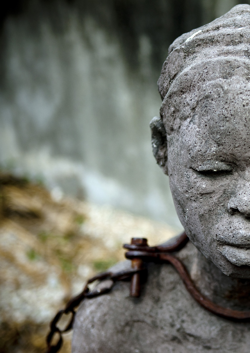
_-_USNWR.jpg)
.png&action=edit§ion=T-1)
![[1]](https://commons.wikimedia.org/w/index.php?title=Commons:Featured_picture_candidates/File:Wasp_October_2007-5.jpg&diff=19789749&oldid=19716966)
![[2]](https://commons.wikimedia.org/w/index.php?title=Commons:Featured_picture_candidates/File:Sarcophaga_Bercaea2.jpg&diff=19789985&oldid=19713608)
![[4]](https://commons.wikimedia.org/w/index.php?title=Commons:Featured_picture_candidates/File:Tachina_fly_Gonia_capitata_feeding_honey.jpg&diff=19789847&oldid=19755559)
,_not_featured)
,_not_featured)
.jpg&action=edit§ion=T-1)
.jpg,_not_featured)
.jpg,_not_featured)
.jpg&action=edit§ion=T-1)
.jpg,_not_featured)
.jpg,_not_featured)
.JPG&action=edit§ion=T-1)
.JPG,_not_featured)
.JPG,_not_featured)
.JPG&action=edit§ion=T-1)
.JPG,_not_featured)
.JPG,_not_featured)
_in_Amritsar,_India.jpg&action=edit§ion=T-1)
_in_Amritsar,_India.jpg,)
_in_Amritsar,_India.jpg,)
.jpg)
.jpg&action=edit§ion=T-1)
.jpg,_featured)
.jpg,_featured)


.jpg&action=edit§ion=T-1)
.jpg)
.jpg,_not_featured)
.jpg,_not_featured)


.jpg&action=edit§ion=T-1)
.jpg)
.jpg)
.jpg)


 Confused: I`m sorry, but what is the point of nominating a picture that is already featured? Precisely what will it accomplish? Sarcastic ShockwaveLover (talk) 10:59, 18 April 2009 (UTC)
.jpg)
.jpg)
.jpg,_featured)
.jpg,_featured)
.jpg,_featured)


.jpg&action=edit§ion=T-1)
.jpg)
.jpg,_not_featured)
.jpg,_not_featured)


 Awesome! That tutorial will be very helpful to me as well. --Notyourbroom (talk) 23:51, 13 April 2009 (UTC)


.jpg&action=edit§ion=T-1)
.jpg)
.jpg,_not_featured)
.jpg,_not_featured)


.jpg&action=edit§ion=T-1)
.jpg)
.jpg,_not_featured)
.jpg,_not_featured)


_-_speed_run_-_080804-N-0000X-006.jpg&action=edit&redlink=1)
_-_speed_run_-_080804-N-0000X-006.jpg&action=edit§ion=T-1)
_-_speed_run_-_080804-N-0000X-006.jpg,_not_featured)
_-_speed_run_-_080804-N-0000X-006.jpg,_not_featured)
_-_speed_run_-_080804-N-0000X-006.jpg,_not_featured)


_(1).jpg&action=edit§ion=T-1)
_(1).jpg)
_(1).jpg,_featured)
_(1).jpg,_featured)


.jpg&action=edit§ion=T-1)
.jpg)
.jpg,_not_featured)
.jpg,_not_featured)
.jpg&action=edit§ion=T-1)
.jpg)
.jpg,_not_featured)
.jpg,_not_featured)
.jpg&action=edit§ion=T-1)
.jpg)
.jpg,_not_featured)
.jpg,_not_featured)
.jpg&action=edit§ion=T-1)
.jpg)
.jpg,_not_featured)
.jpg,_not_featured)
.jpg&action=edit§ion=T-1)
.jpg)
.jpg,_not_featured)
.jpg,_not_featured)


.jpg&action=edit§ion=T-1)
.jpg)
.jpg,_not_featured)
.jpg,_not_featured)


_Ellen_Terry_(%27Choosing%27)_by_George_Frederic_Watts.jpg&action=edit§ion=T-1)
_Ellen_Terry_(%27Choosing%27)_by_George_Frederic_Watts.jpg)
_Ellen_Terry_('Choosing')_by_George_Frederic_Watts.jpg,_feature)
_Ellen_Terry_('Choosing')_by_George_Frederic_Watts.jpg,_feature)


_with_mealworm.jpeg&action=edit§ion=T-1)
_with_mealworm.jpeg)
_with_mealworm.jpeg,_not_featured)
_with_mealworm.jpeg,_not_featured)
_with_mealworm.jpeg,_not_featured)
